Wilder
Brand Identity & Advertising Campaign
Wilder is an all-natural honey brand sourced exclusively from wild bees, with no additives or processing. The challenge was to create a visual identity that communicated the product’s authenticity and connection to nature while giving the brand a distinctive personality in a crowded honey market.
The identity was built around the idea of honey that comes straight from the wild. A hand-drawn cowboy chasing a giant bee with a lasso became the central visual, bringing a sense of adventure, humor, and untamed character to the brand. The handwritten calligraphy-style logo complements the sketch-like illustration, creating a cohesive, handcrafted feel.
An earthy palette of brown, tan, red, and green reinforces the natural origins of the product while giving the brand a warm, rustic character. Together, the identity and advertising campaign position Wilder as authentic, adventurous, and unapologetically wild.


Lions Den Story Company
Branding & Advertising
The branding for Lions Den Story Company was inspired by the biblical tale of Daniel in the lion's den. The logo blends the themes of courage, wisdom, and narrative power. Incorporating elements such as a lion in a hand drawn style that conveys the idea of resilience, protection, and innovation, while continuing to sustain a clean aesthetic appropriate for branding. The Lions Den Story Company branding elements include logo variations, branded merchandise, an engaging app allowing users to watch the shows Lions Den Story Company has to offer, a professionally designed DVD for "The Story of Daniel", a show created by Lions Den Story Company, and a striking billboard campaign to promote the show.
The initiative captures the themes of courage, faith, and resilience, bringing together contemporary design with timeless influence.


The Platypie
Branding, Packaging, Signage, & Print
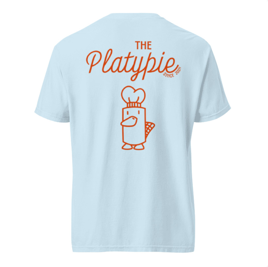
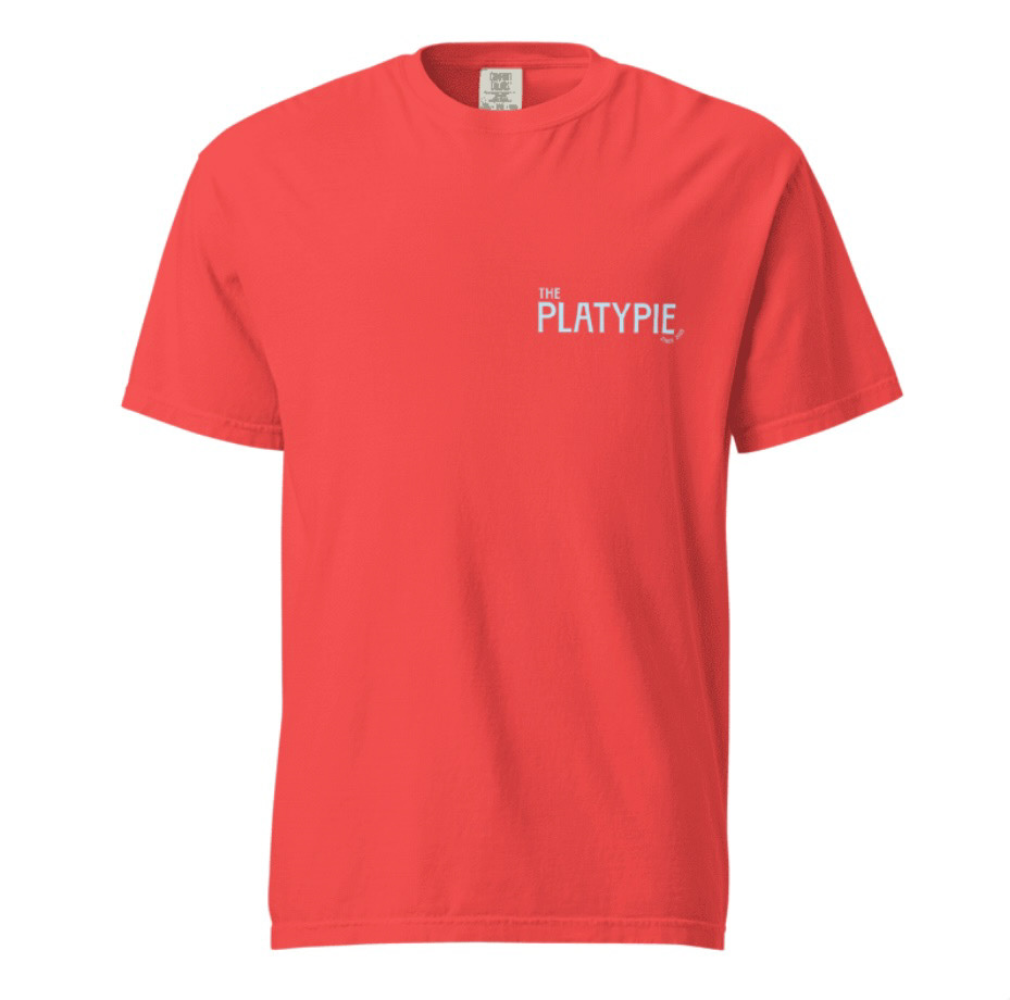
For The Platypie, a quirky and modern pizza restaurant, I developed a playful brand identity centered around a unique logo: a platypus wearing a chef hat. The visual design combines light blue and bright orange-red to create a fresh, energetic palette that stands out while staying approachable. The branding extends across menus, packaging, and signage, reinforcing the restaurant's fun and memorable personality. This project showcases a balance of creativity and consistency, aimed at attracting a wide audience while emphasizing the restaurant's distinctive charm.