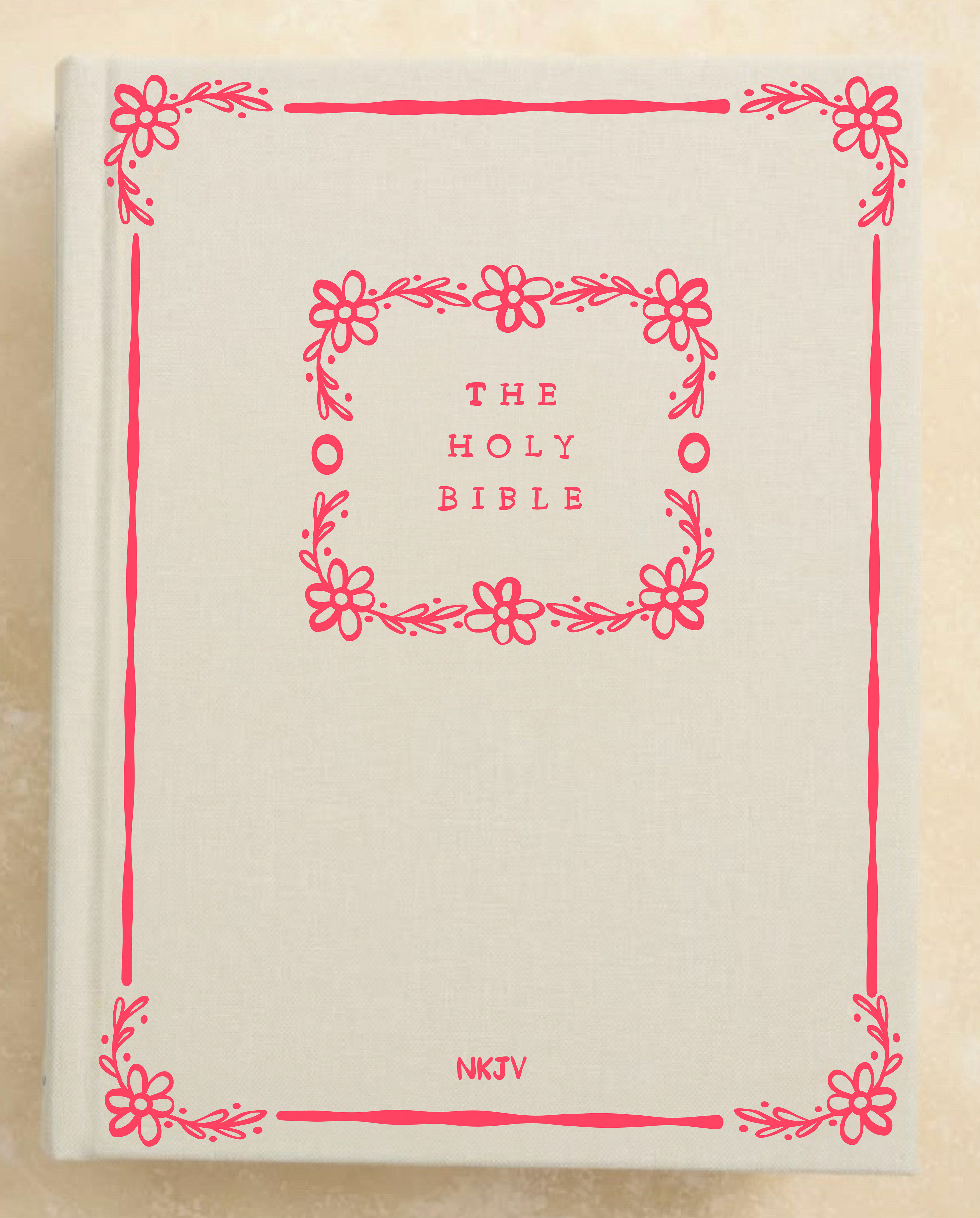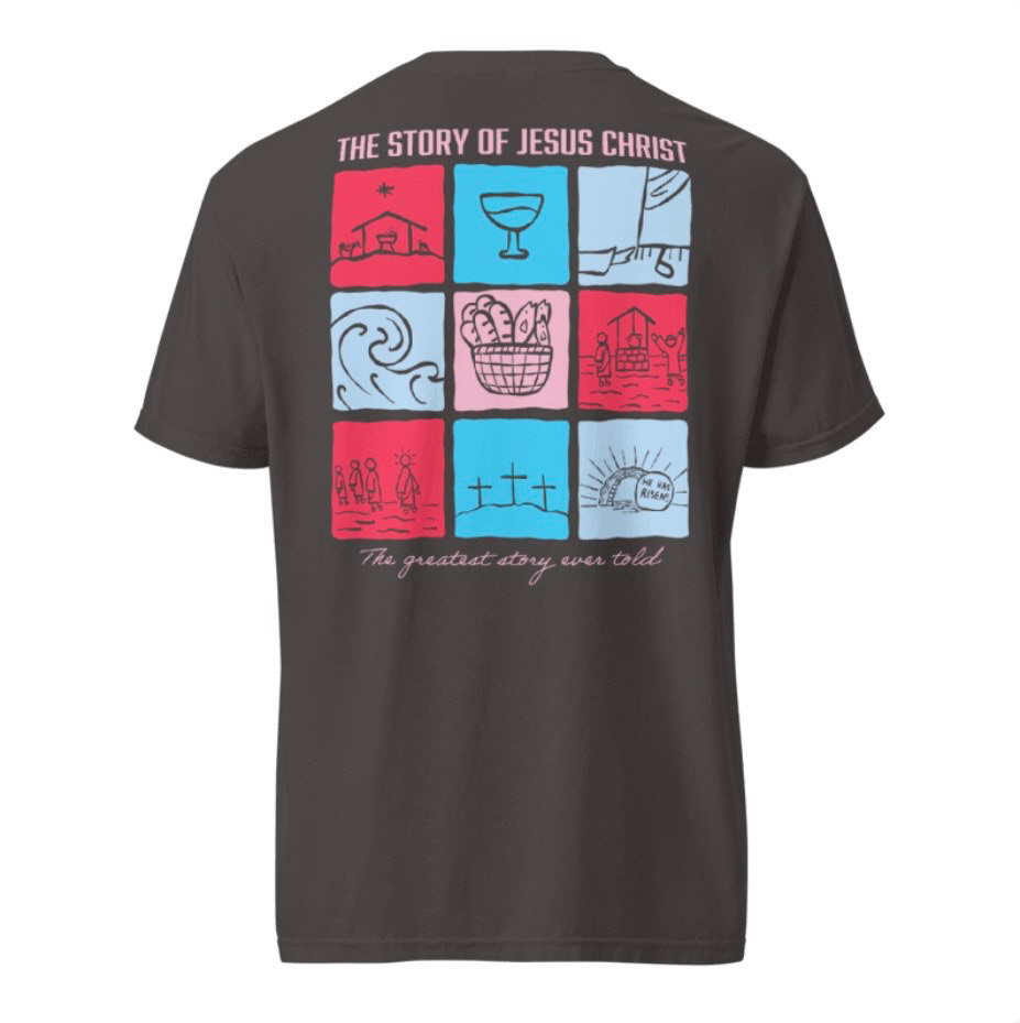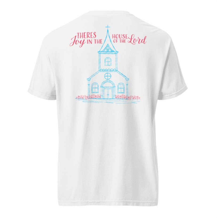
Holy Week Sermon Series
Branding & Illustration
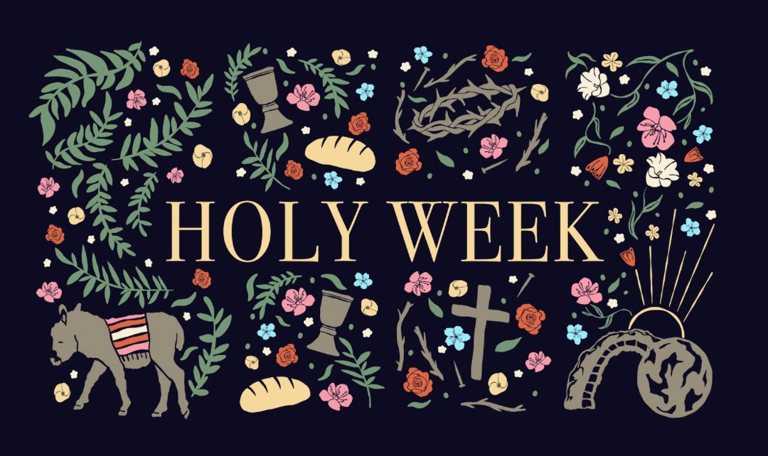
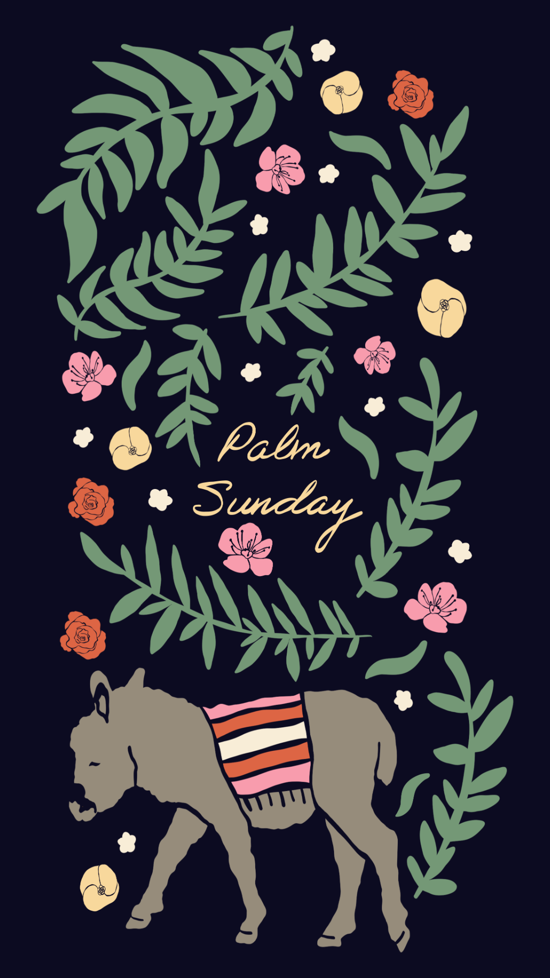
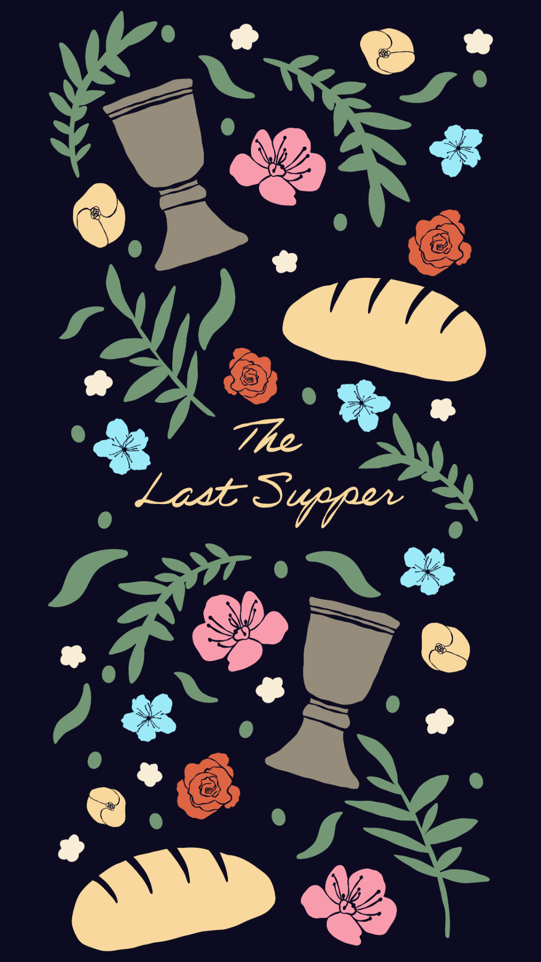
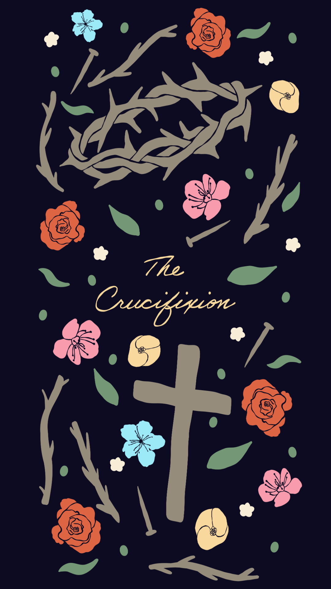
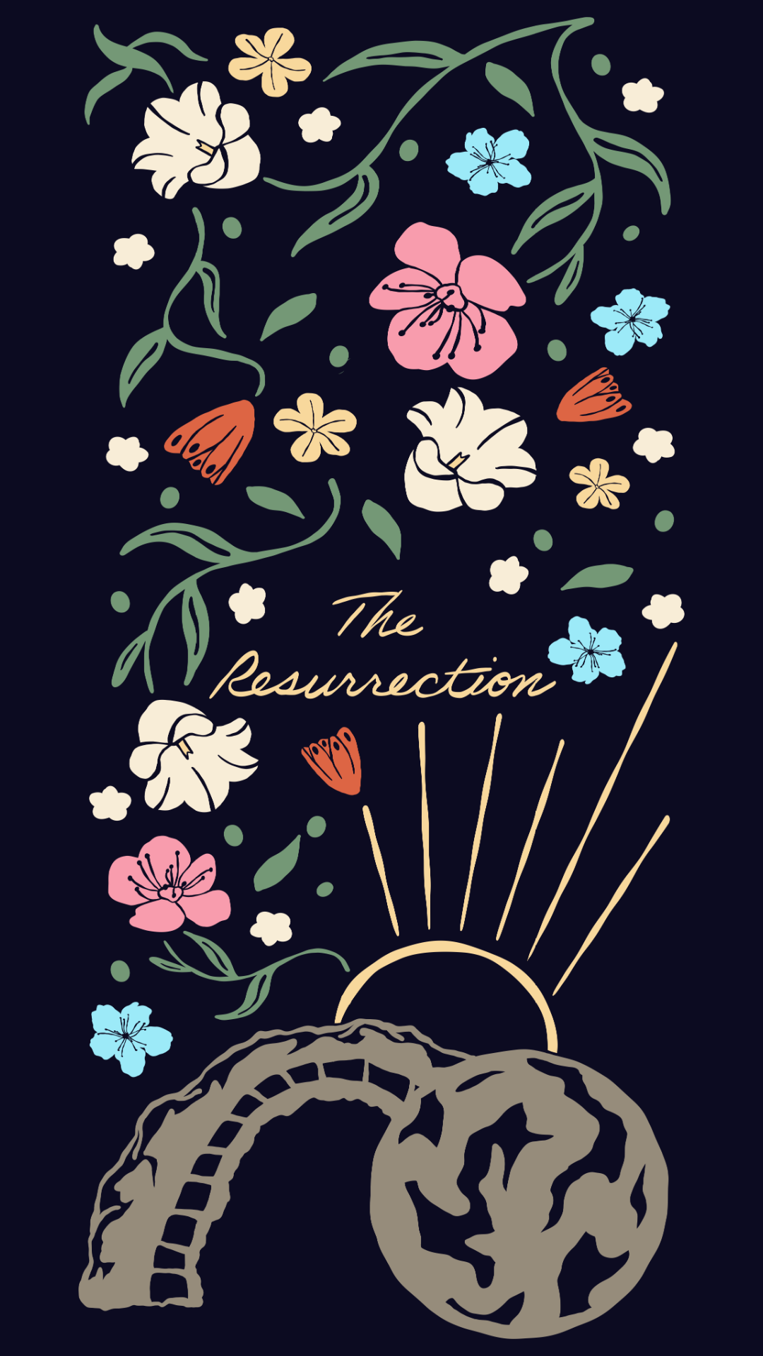
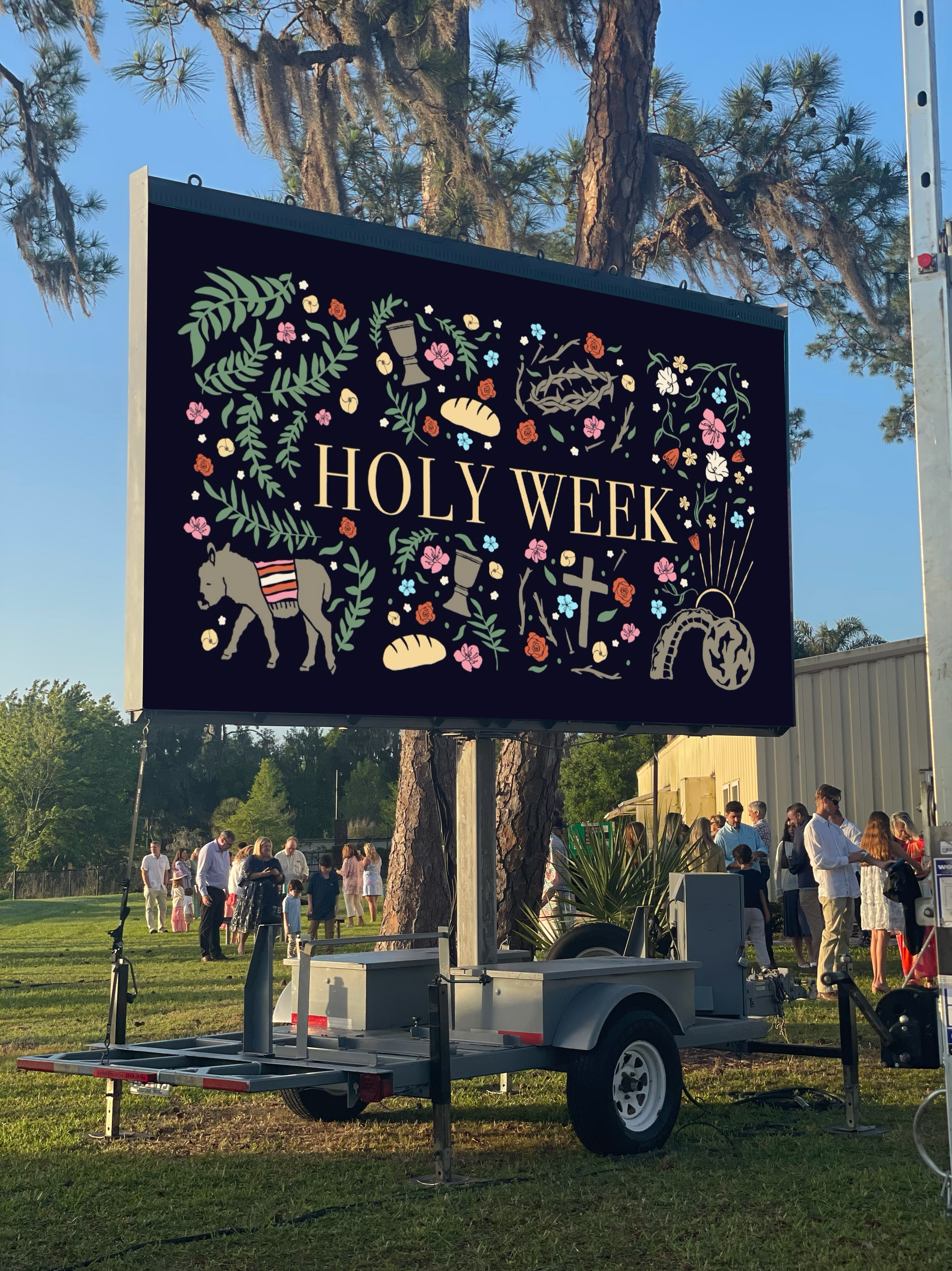
A cohesive Holy Week sermon series cover designed for a church setting, combining hand-drawn illustrations with a nature-inspired visual style to tell the Easter story from Palm Sunday through the Resurrection.
Each illustration captures a key moment:
-Palm Sunday features a donkey surrounded by palm branches, falling leaves, and flowers, symbolizing celebration and anticipation.
-The Last Supper highlights bread loaves and a wine cup with palm leaves and florals, repr.esenting communion and fellowship.
-The Crucifixion uses a crown of thorns, nails, torn twigs, and scattered natural elements to convey sacrifice and sorrow.
-The Resurrection depicts the stone rolled away, sunlight, and blooming foliage, symbolizing hope and new life.
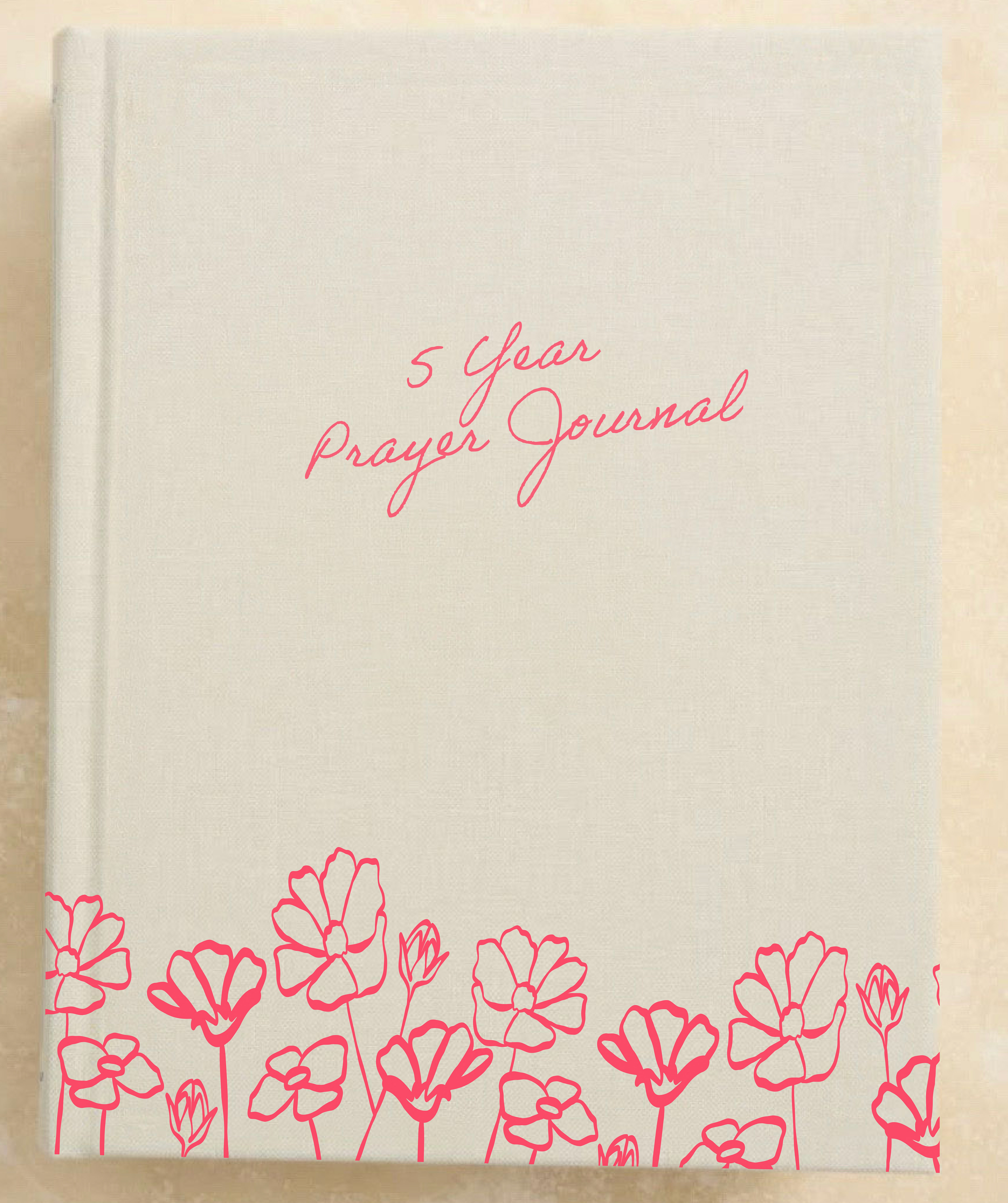
This project demonstrates cohesive visual storytelling, illustration, and the ability to create meaningful, church media that can be used in various formats.
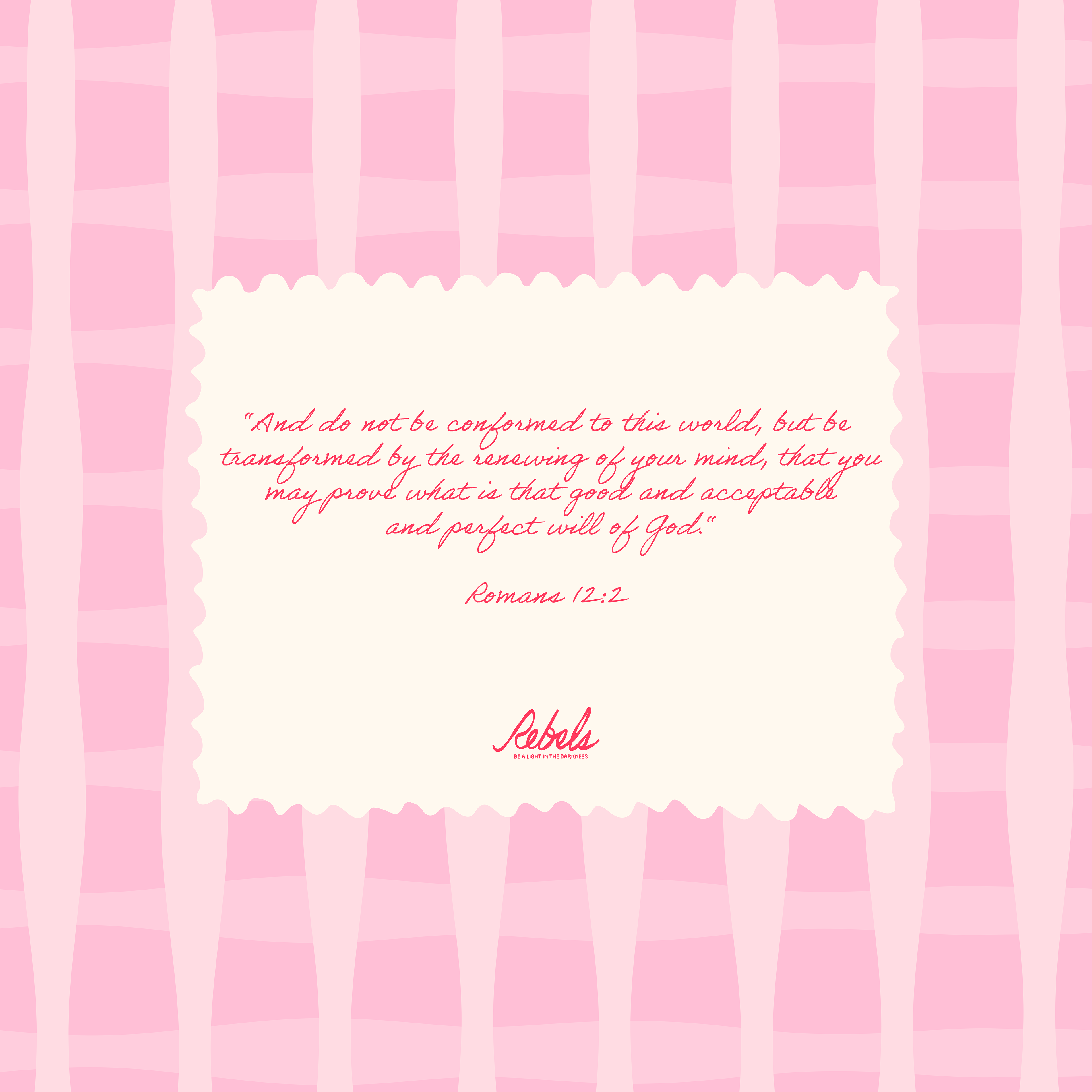
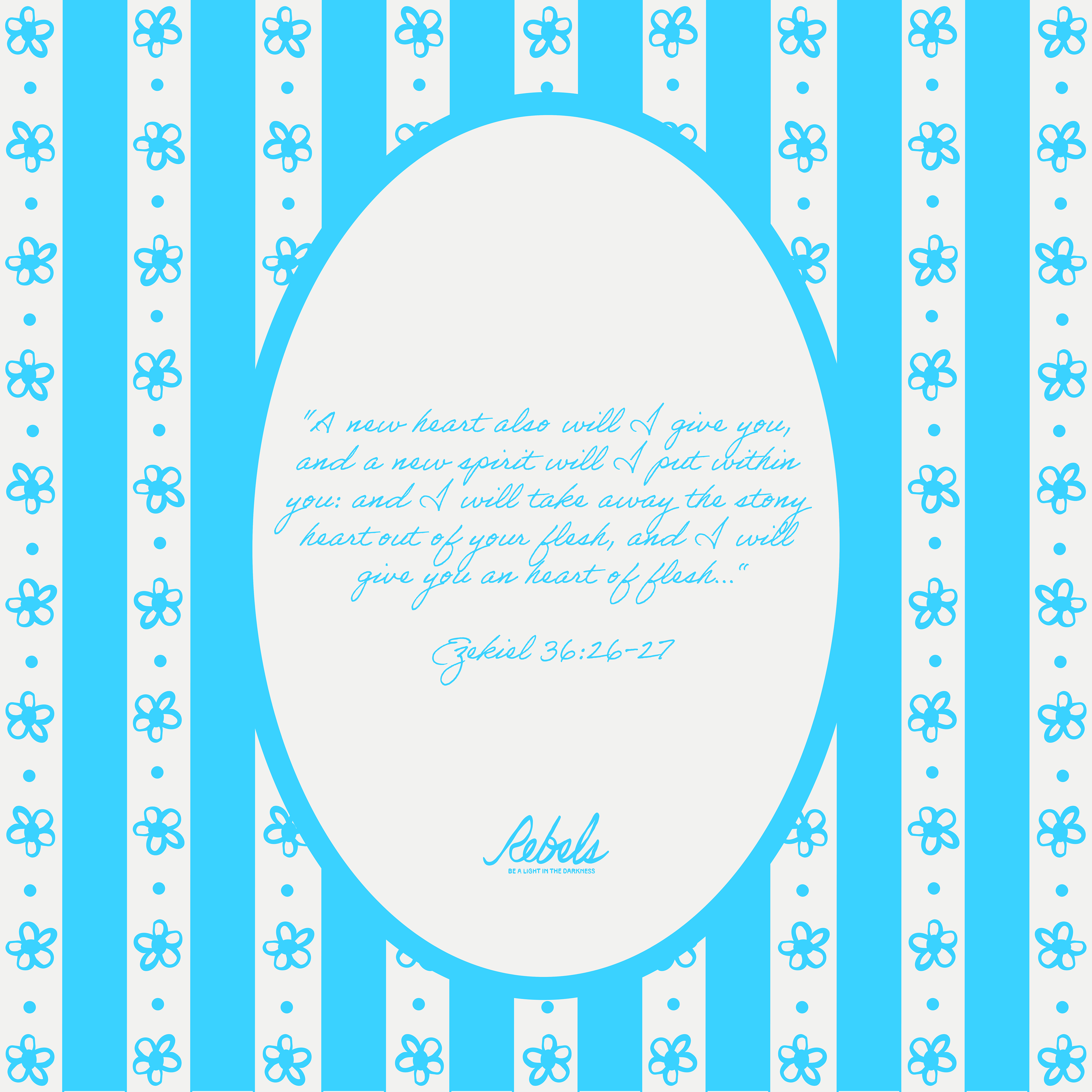
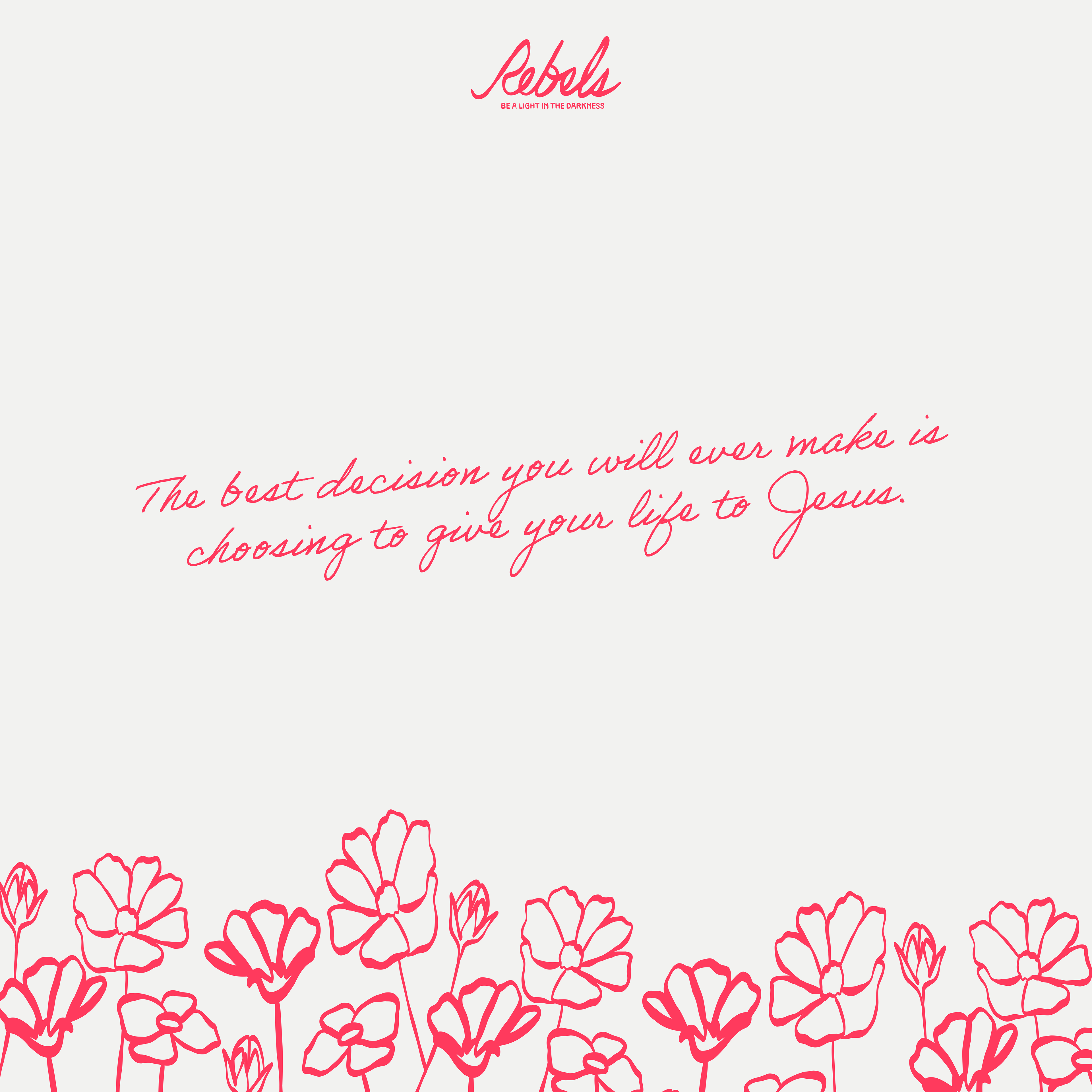
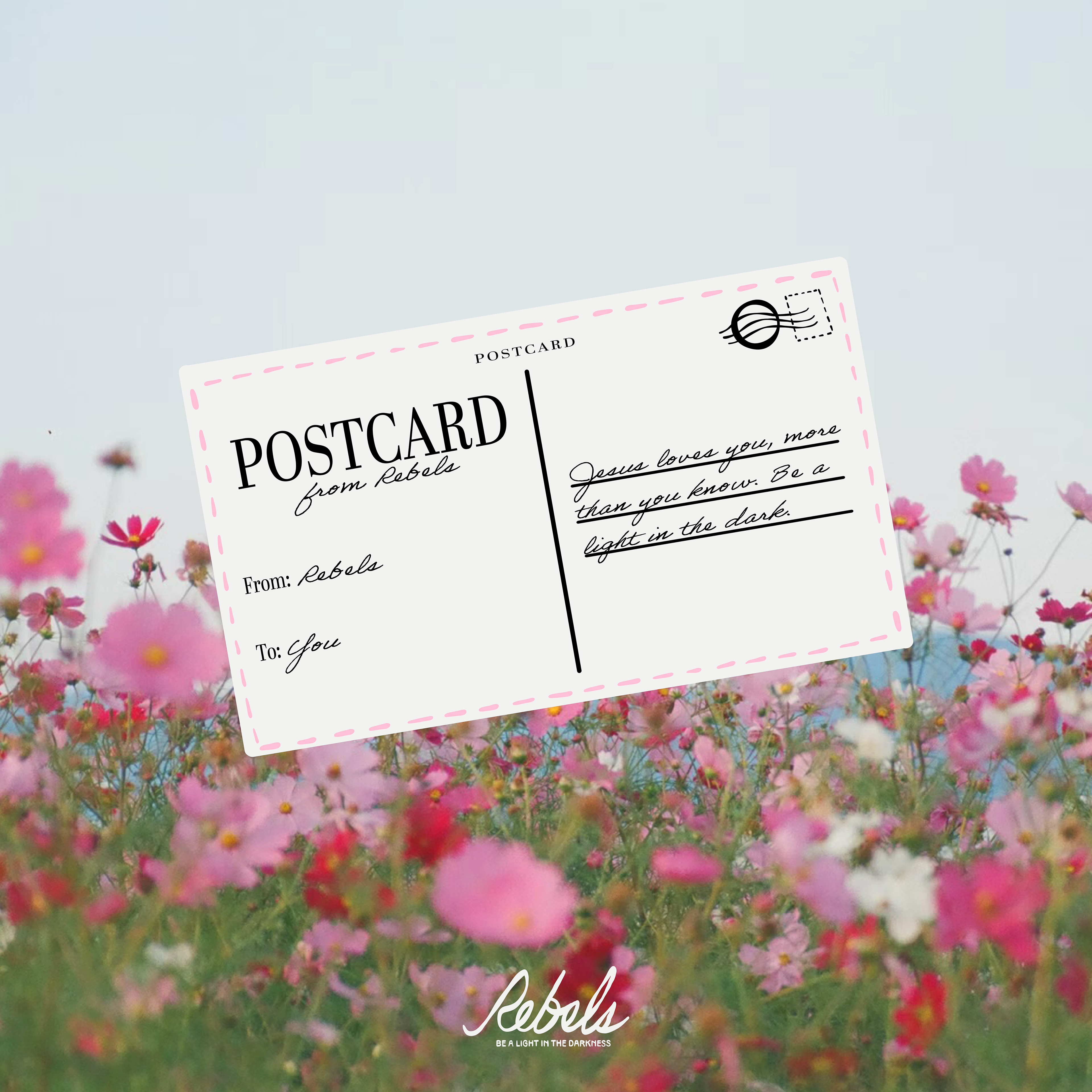
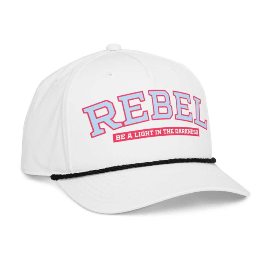
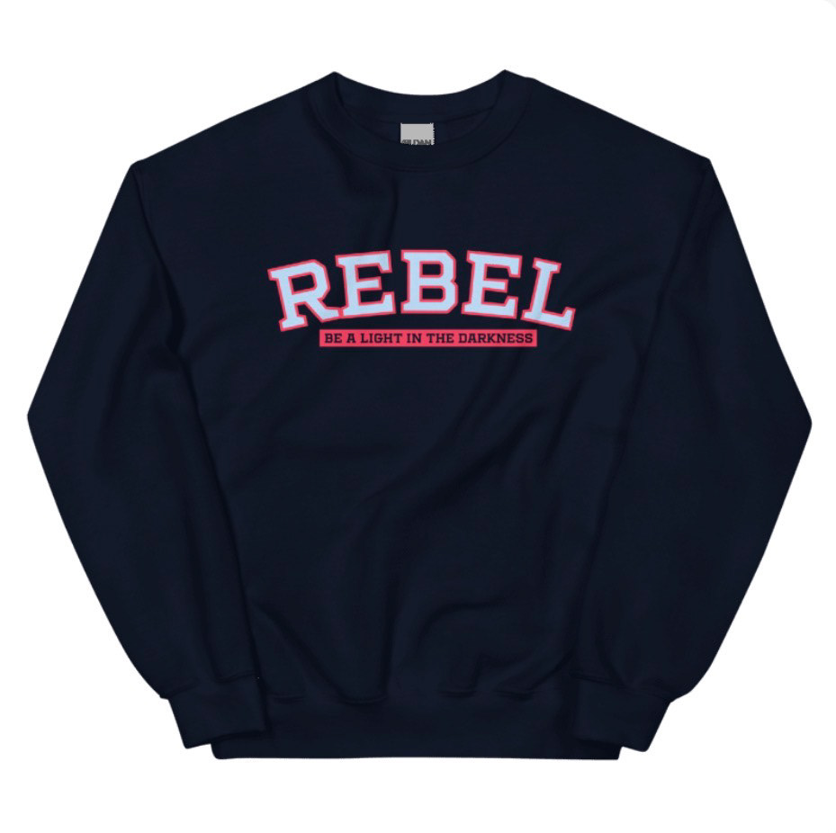
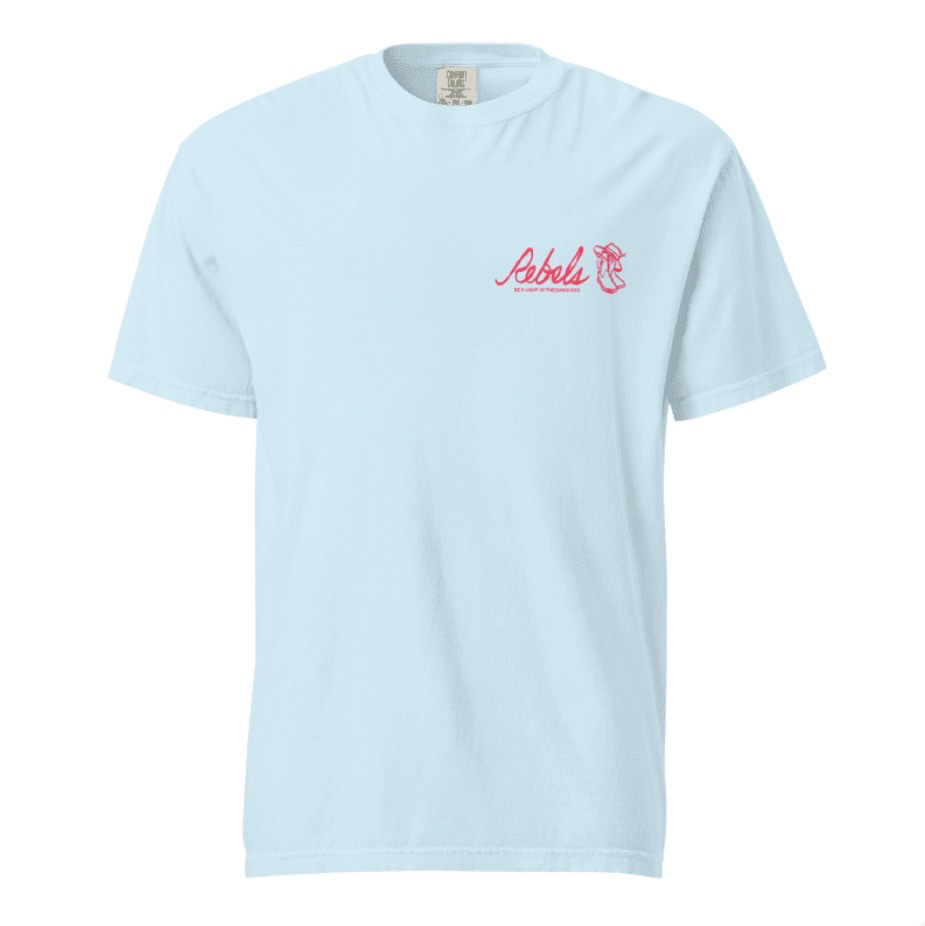
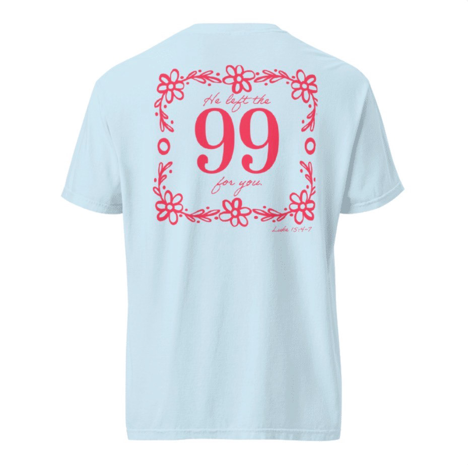
Rebels Ministry
Branding
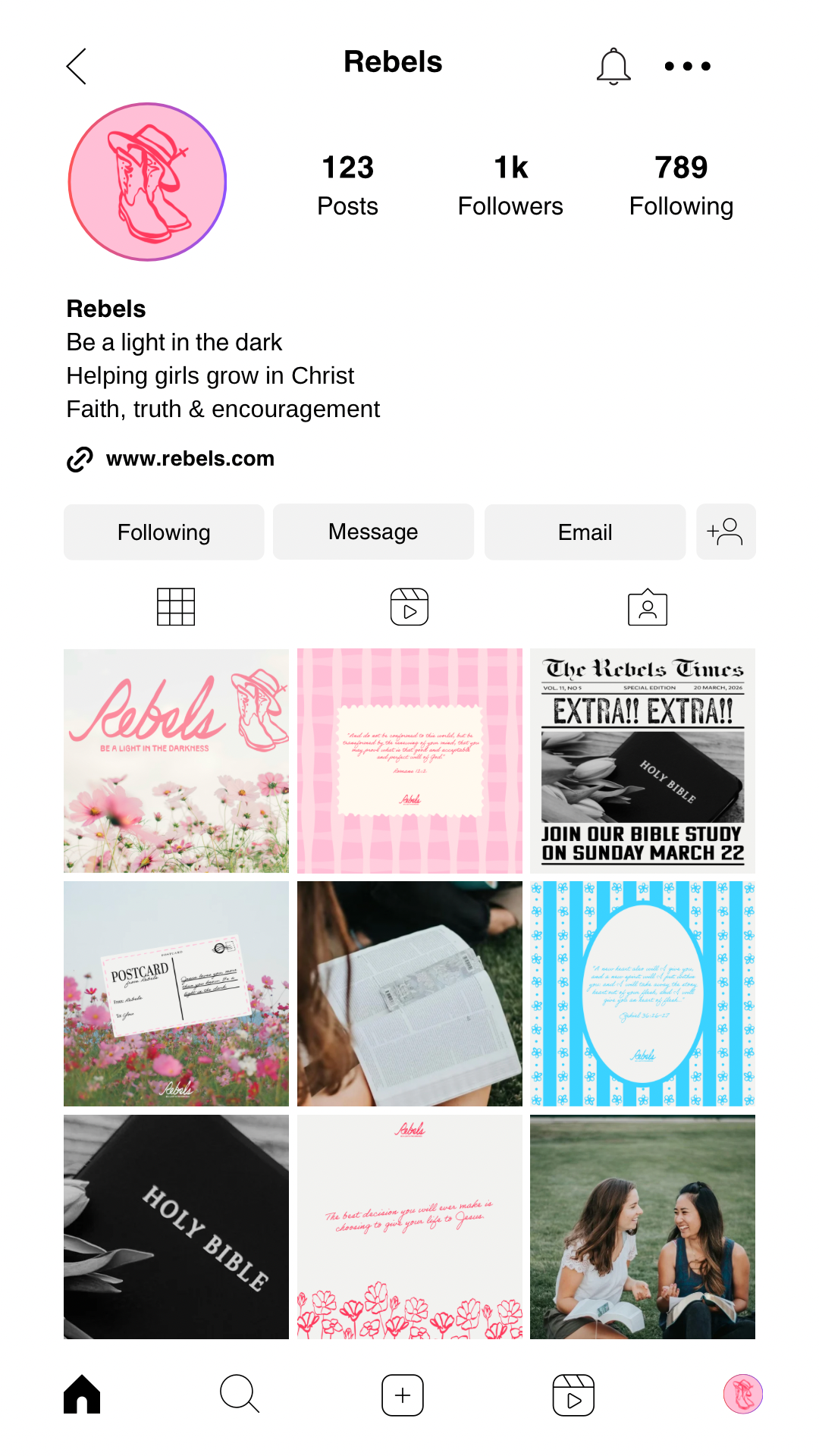
Rebels is a concept brand for a Christian girls ministry created to empower young women to stand boldly in their faith and become a light in the darkness. Inspired by faith communities like Hey Girl Nation founded by Christian artist Anne Wilson, the ministry encourages girls to grow in their relationship with Jesus while building a supportive and uplifting community.
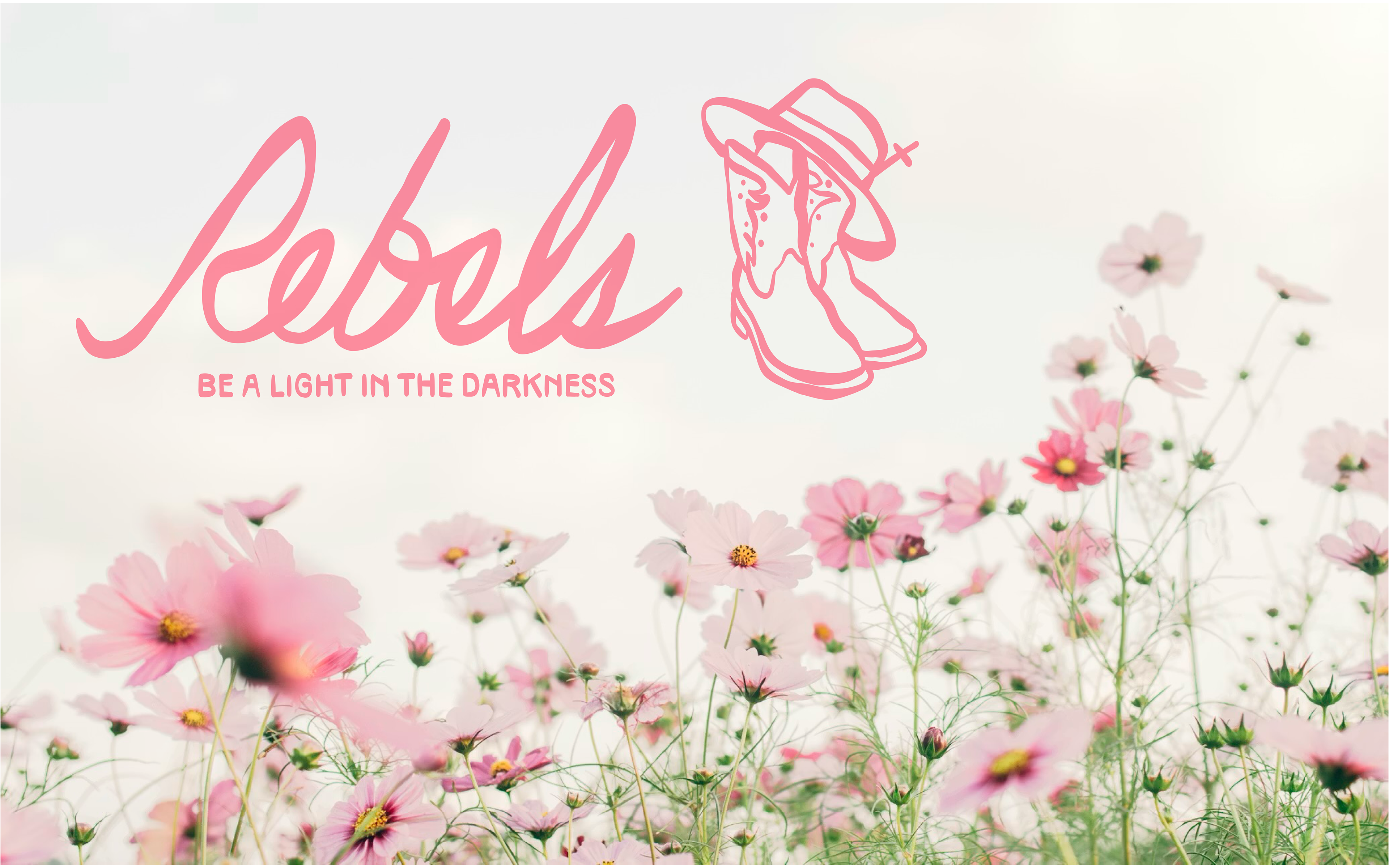
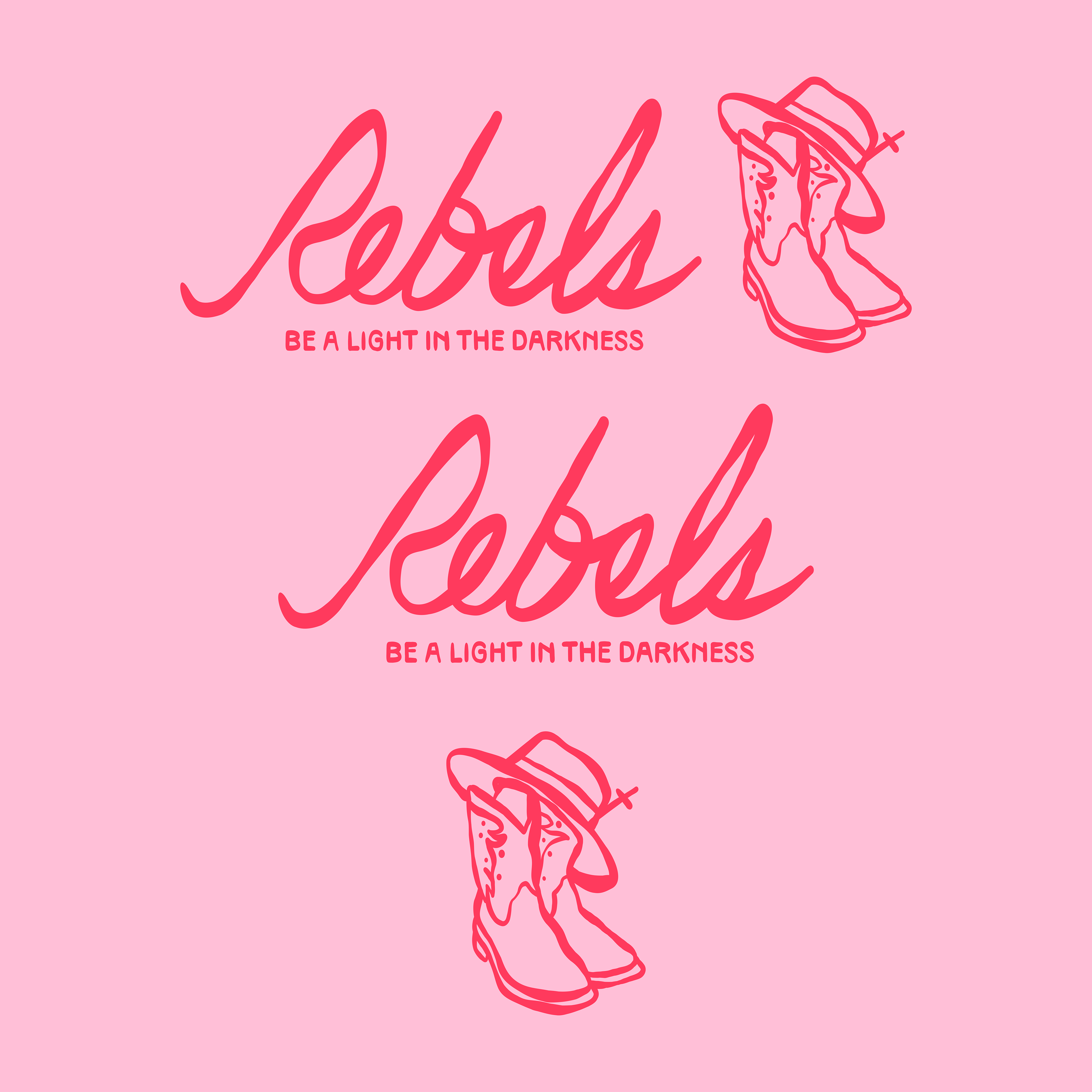
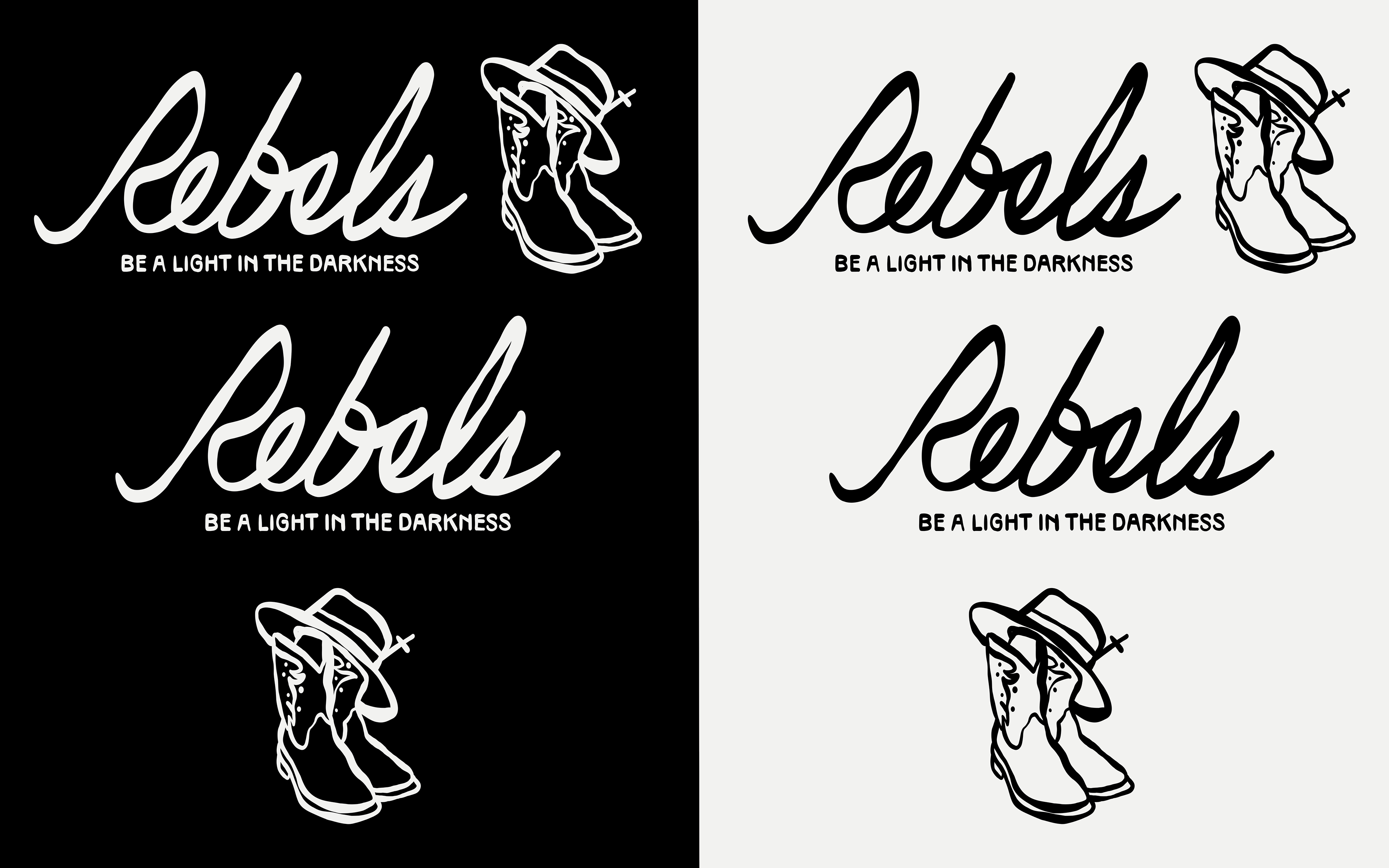
The visual identity was designed to feel bold, expressive, and welcoming to a younger audience. The logo is a handwritten cursive wordmark, giving the brand a personal, authentic feel that reflects the idea of faith as something lived out daily and personally.
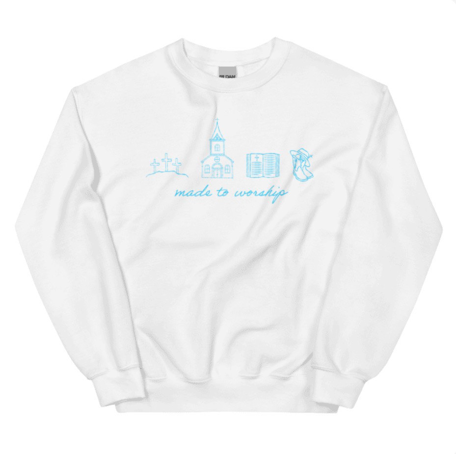
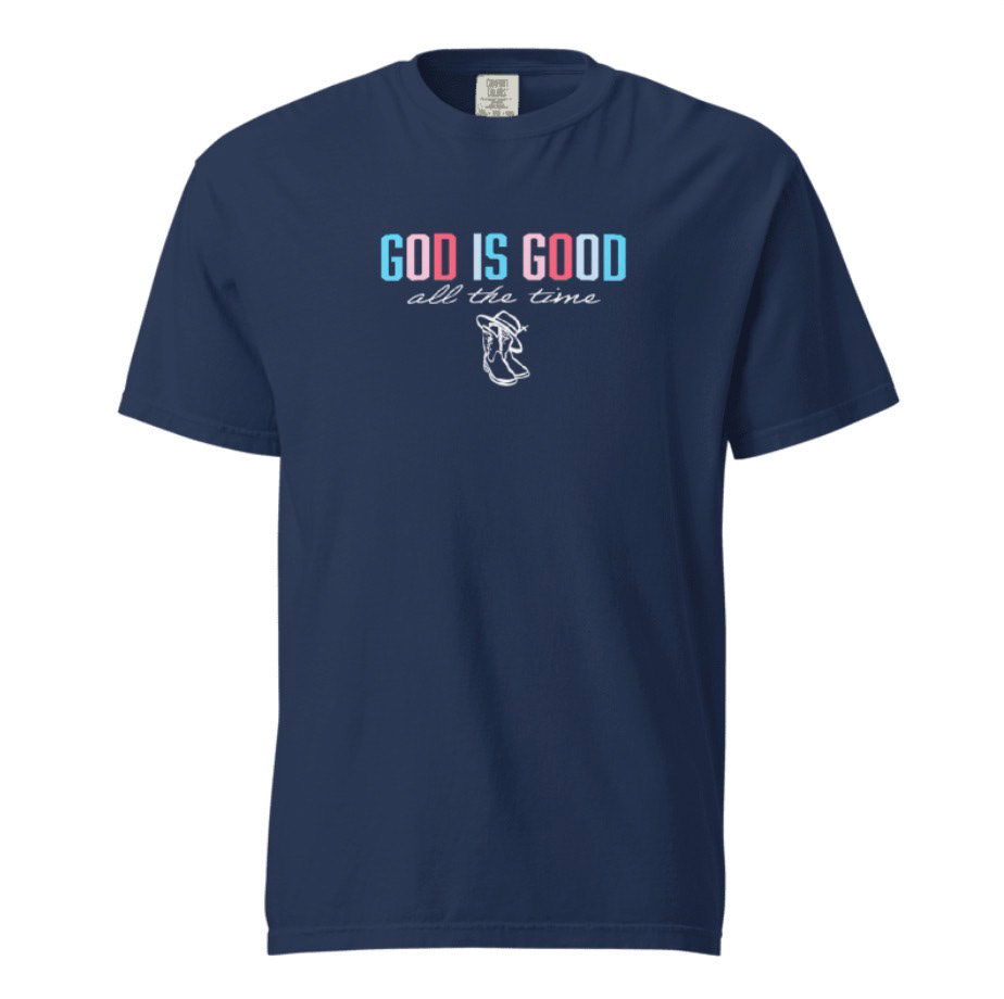
Integrated with the wordmark is an illustrative logo mark featuring cowgirl boots with a cowgirl hat resting on top. A cross rises from the band of the hat, symbolizing that faith in Jesus is the foundation of the movement. The western-inspired imagery represents courage, individuality, and the idea of standing strong in one's beliefs—reinforcing the concept of being a "rebel" for good.
The typography system pairs elegant serif fonts with handwritten script styles to balance strength with warmth and personality. The color palette includes light pink, hot pink, light blue, and teal, with black and white used for contrast and versatility. These colors create a vibrant and uplifting look that resonates with teenage girls while reinforcing themes of hope, joy, and confidence in faith.
The brand identity was designed to work across social media graphics, ministry events, devotional materials, and merchandise, creating a cohesive visual presence that helps the Rebels movement inspire girls to live boldly and shine the light of Jesus in their everyday lives.