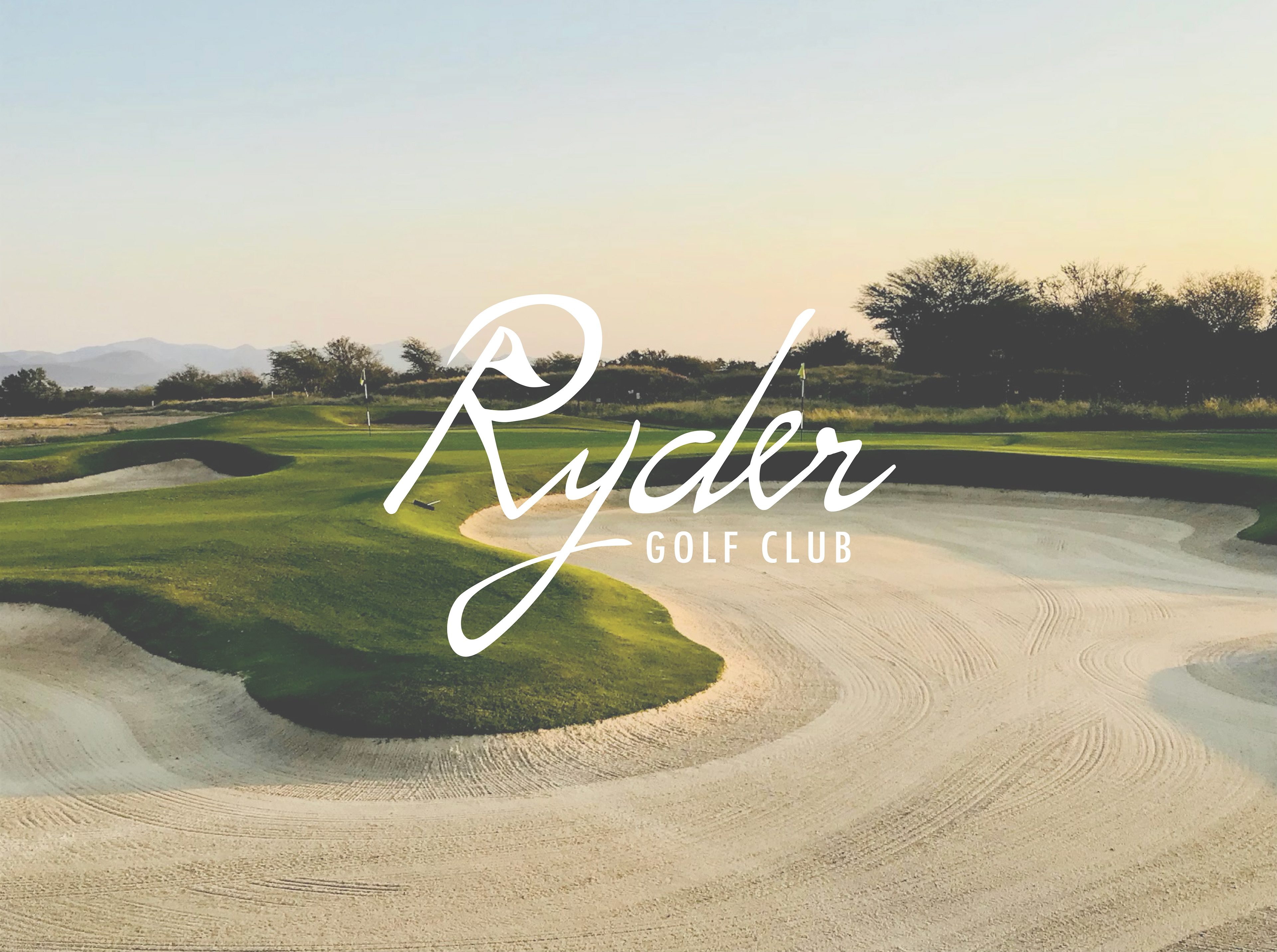
Ryder Golf Club
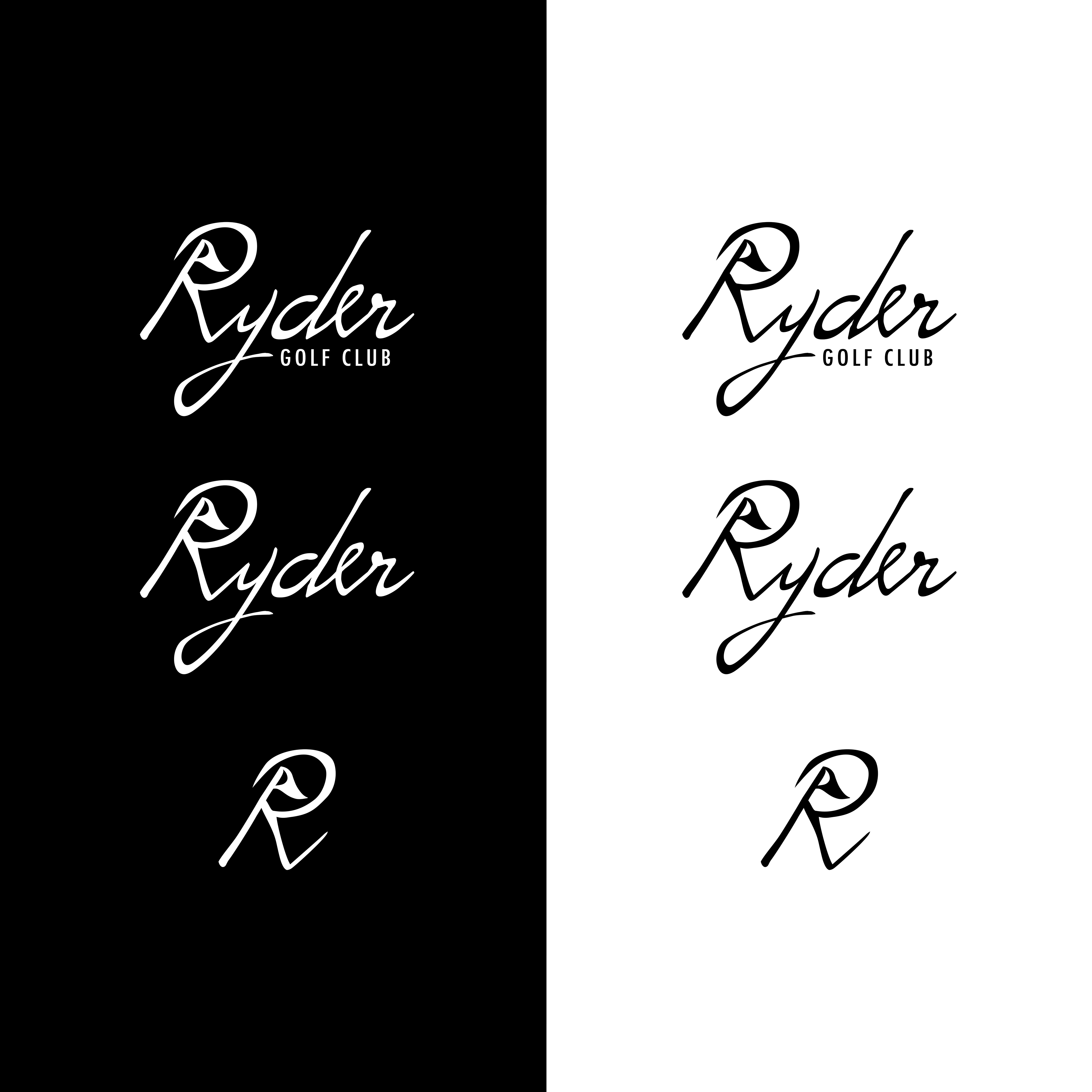
Logo & Branding
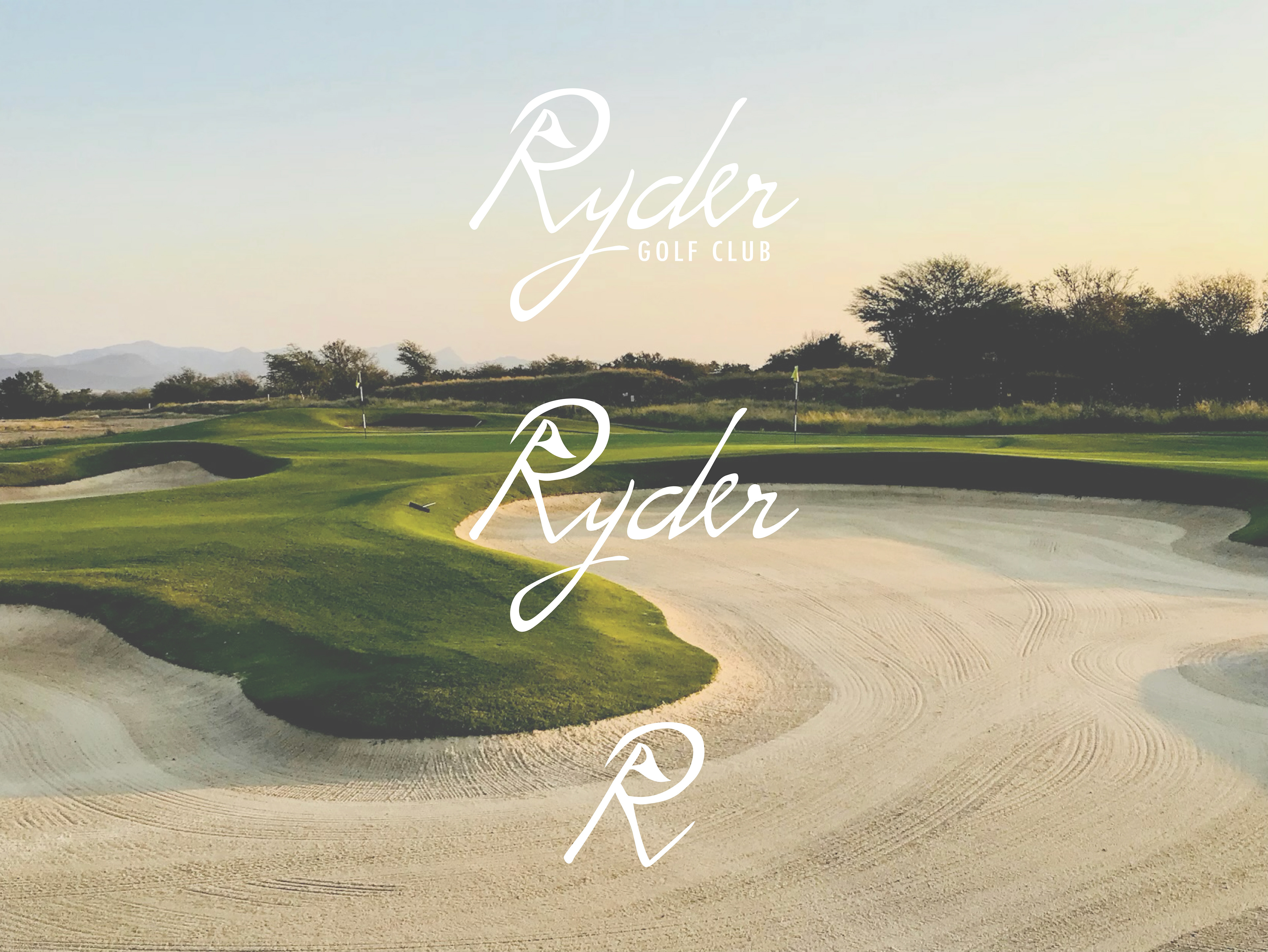
Ryder Golf Club is a lifestyle golf brand inspired by my brother’s love for the game. The goal was to create a brand that blends personal character with classic golf tradition, resulting in a modern yet timeless identity.
The primary logo features “Ryder” in a handwritten style, with the leg of the “R” transformed into a golf flag—subtly tying the typography to the sport. The brand system includes multiple logo variations for versatility across apparel and accessories.
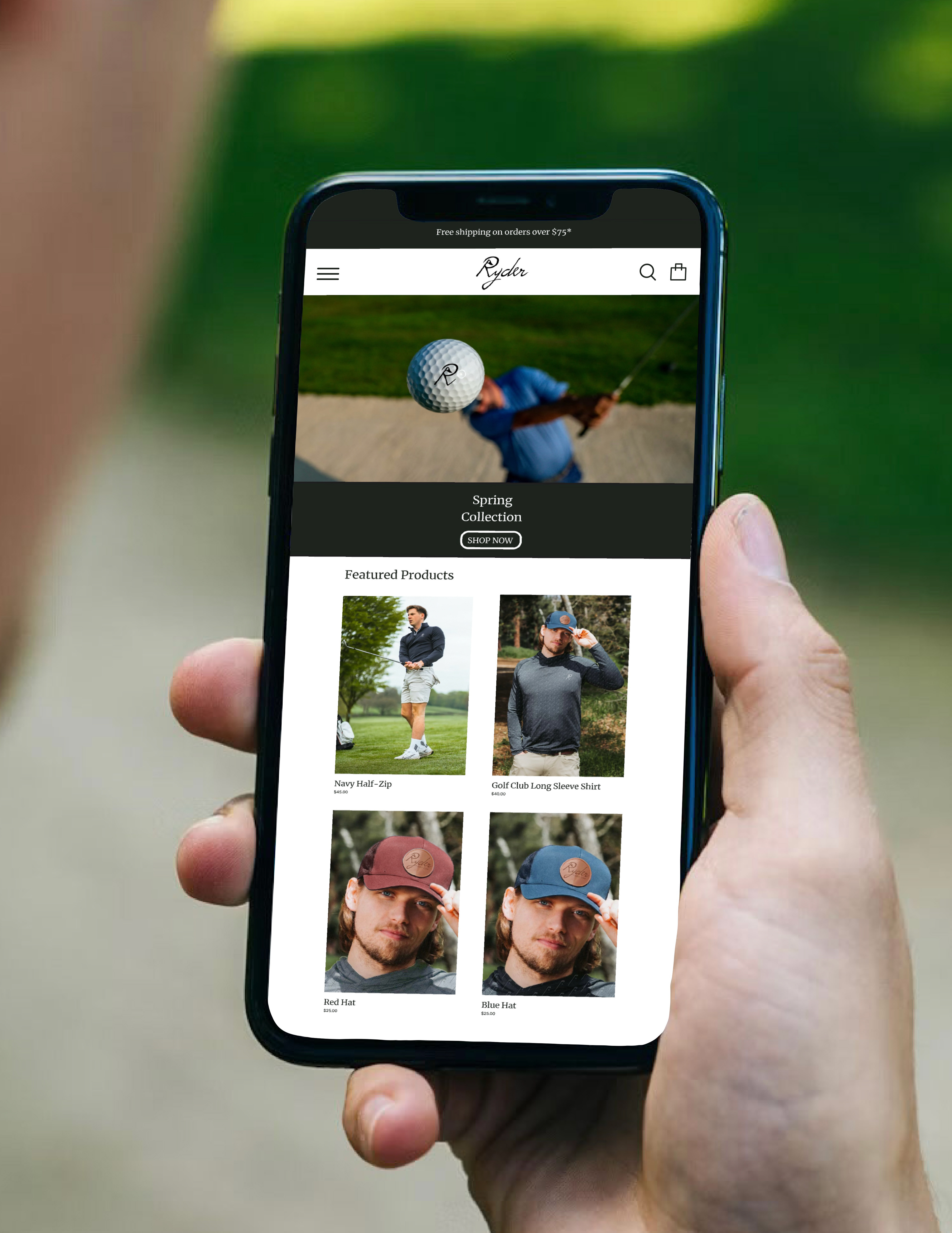
The apparel collection includes an all-over print shirt featuring a repeating golf ball and club pattern, finished with the Ryder logo on the left chest. The hat design incorporates a premium leather circular patch engraved with “Ryder Golf Club,” adding a heritage-inspired touch.
Additional applications such as branded golf balls, accessories, and lifestyle mockups extend the identity into a cohesive, modern golf brand built around personality and passion for the game.


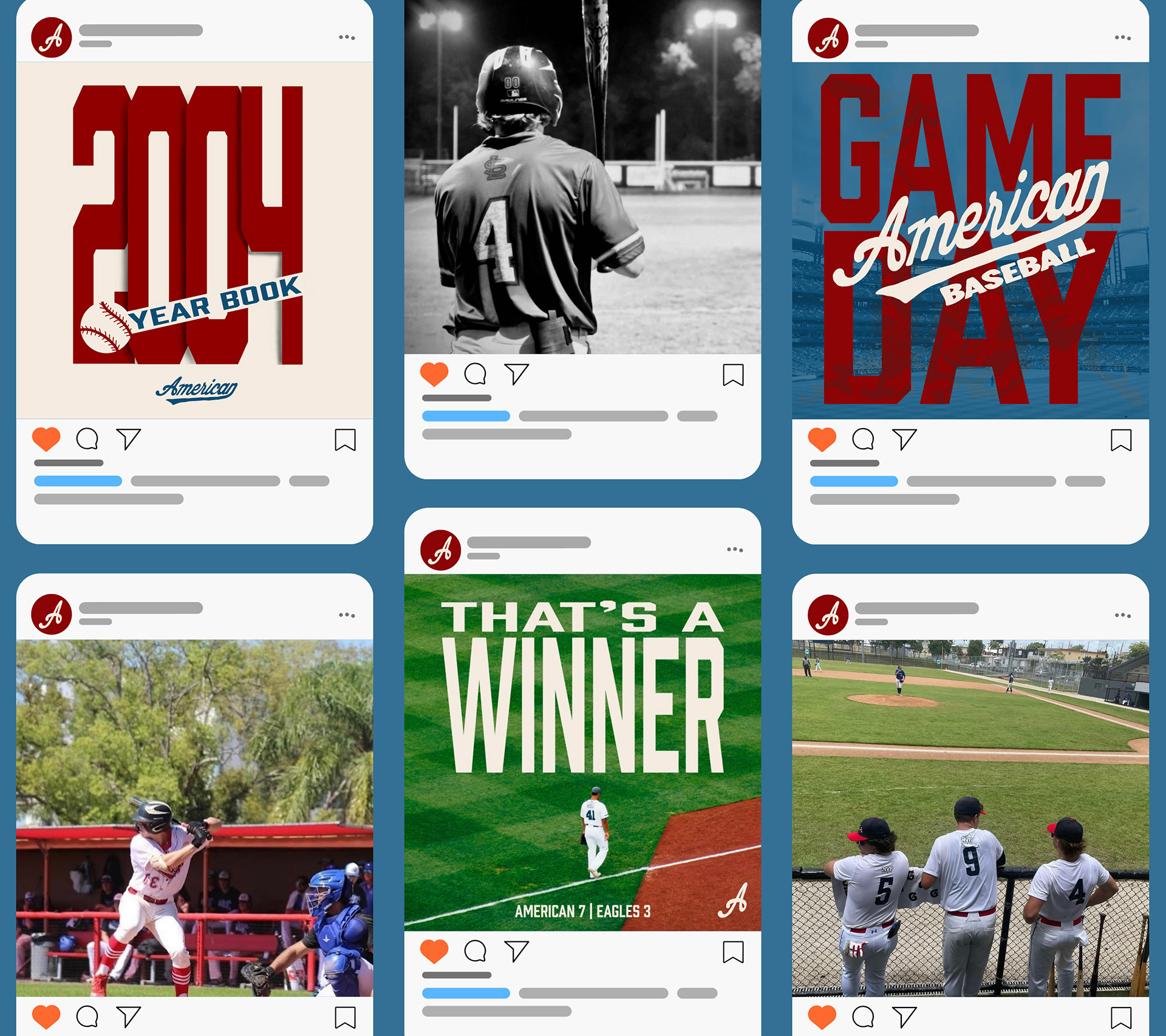
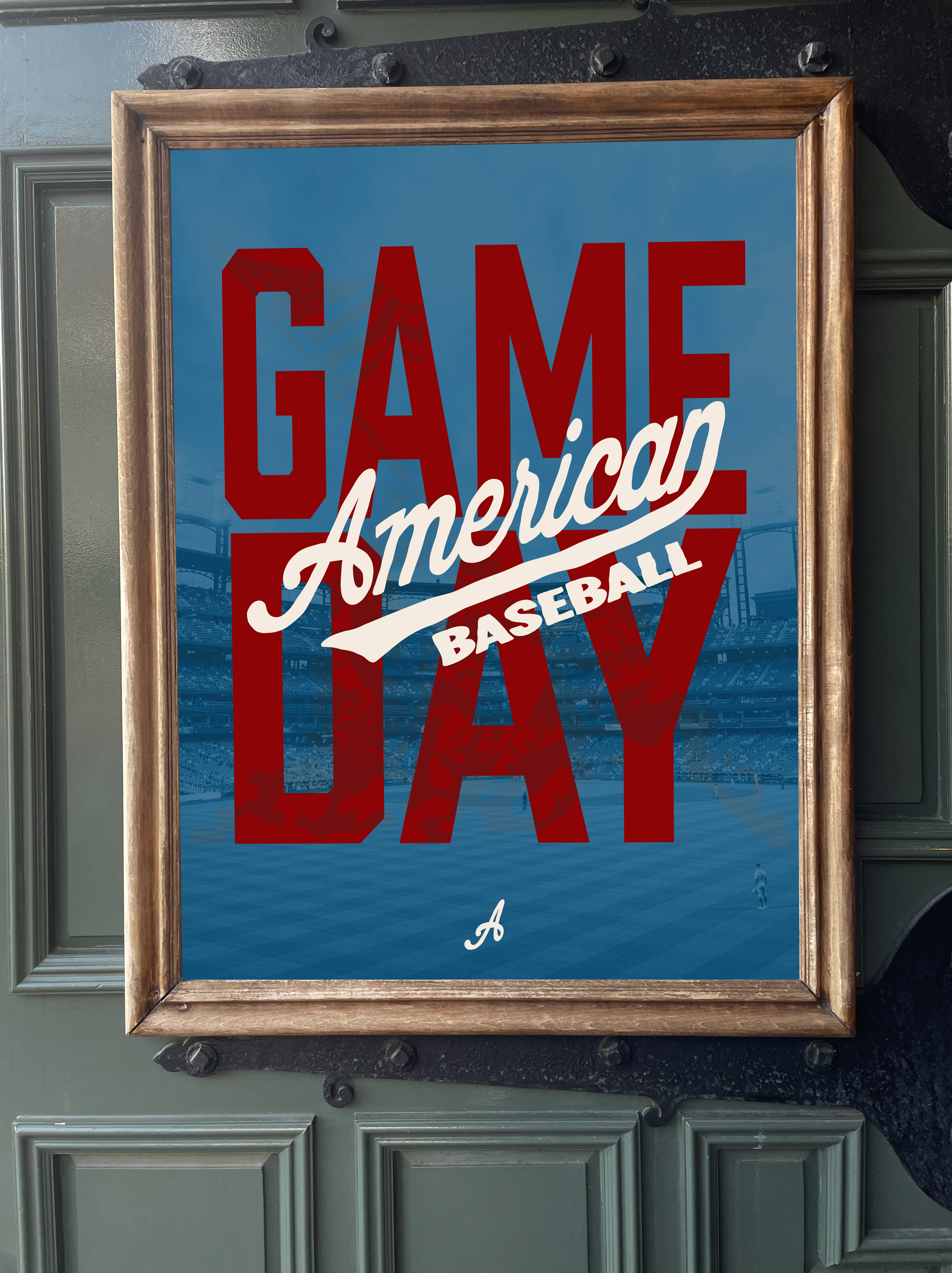
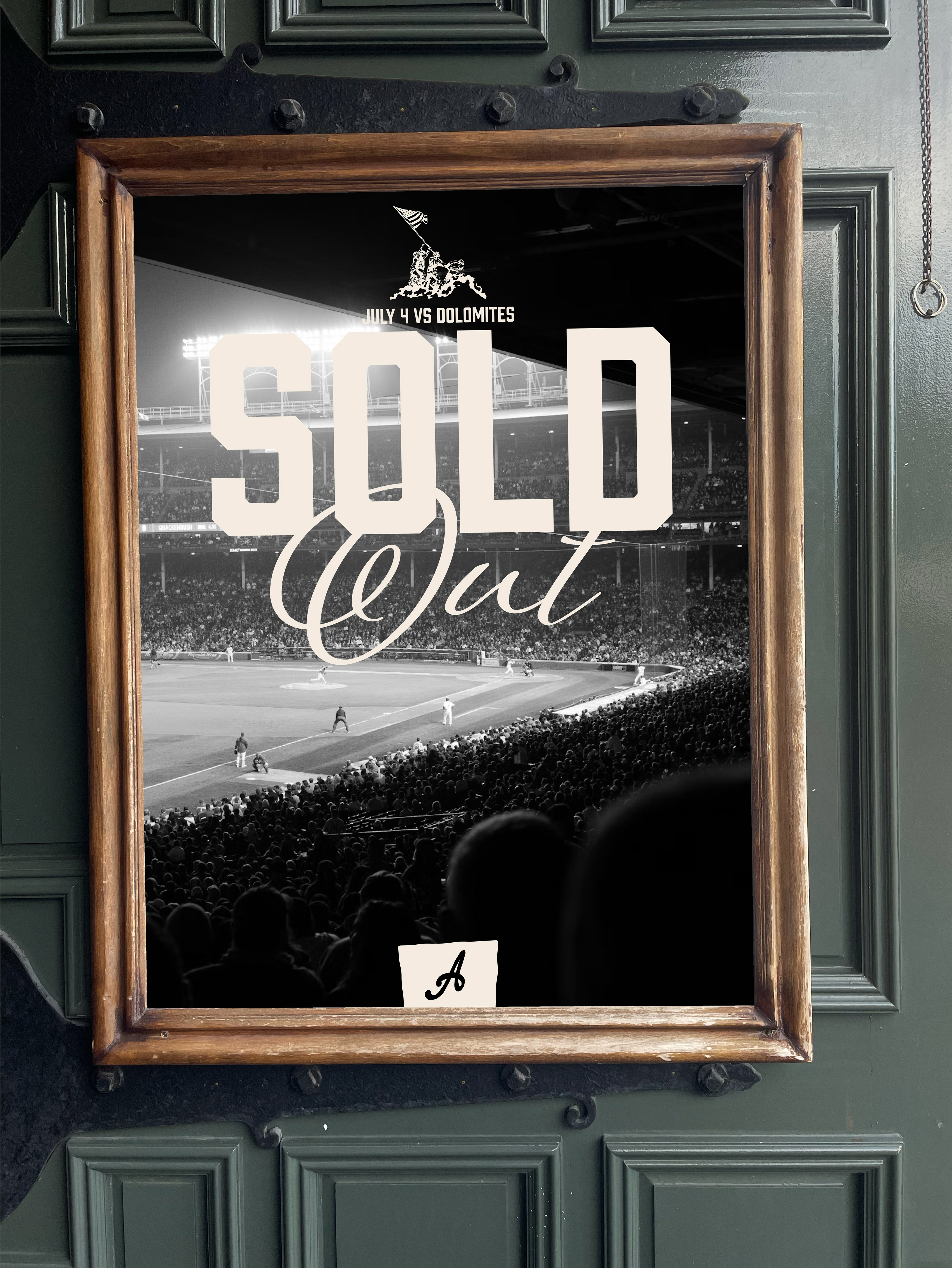
American Baseball
Logo, Print, & Social Media
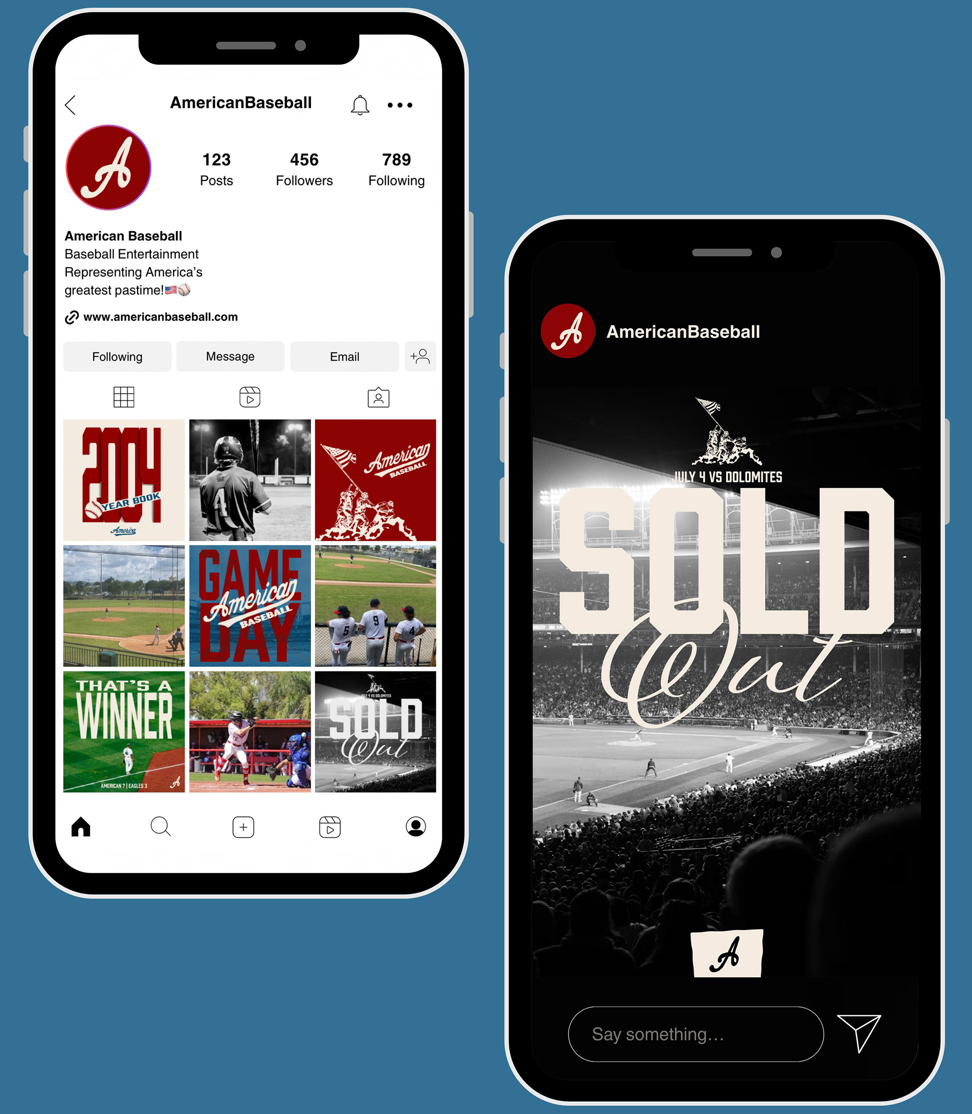
Here you can see various designs from logos and social media, to print and digital pieces all ment to reflect America's greatest pastime and the culture of the game.
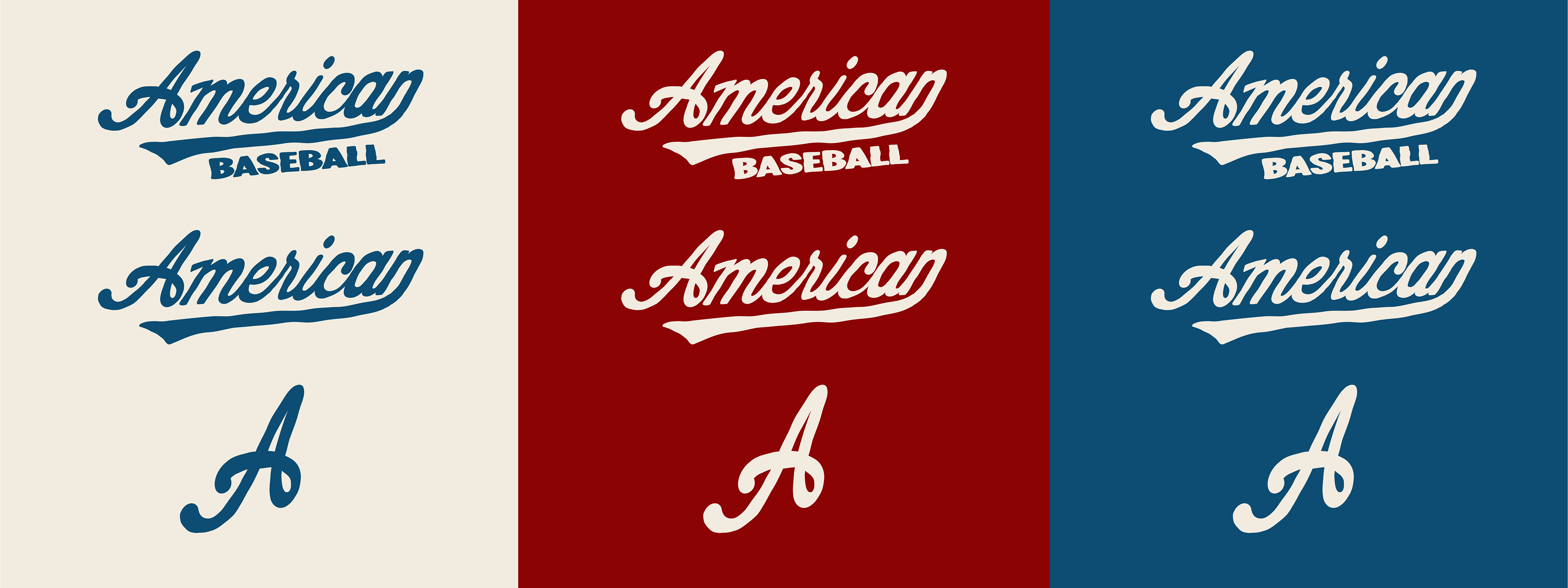
American Baseball is a baseball entertainment company whose logo consists of a vintage, hand-drawn word mark with an alternative variation showcasing the letter A for use in smaller spaces. The branding uses a nostalgic color palette of red, blue, and off-white, blending traditional aesthetics with modern engagement to celebrate the timeless spirit of baseball.
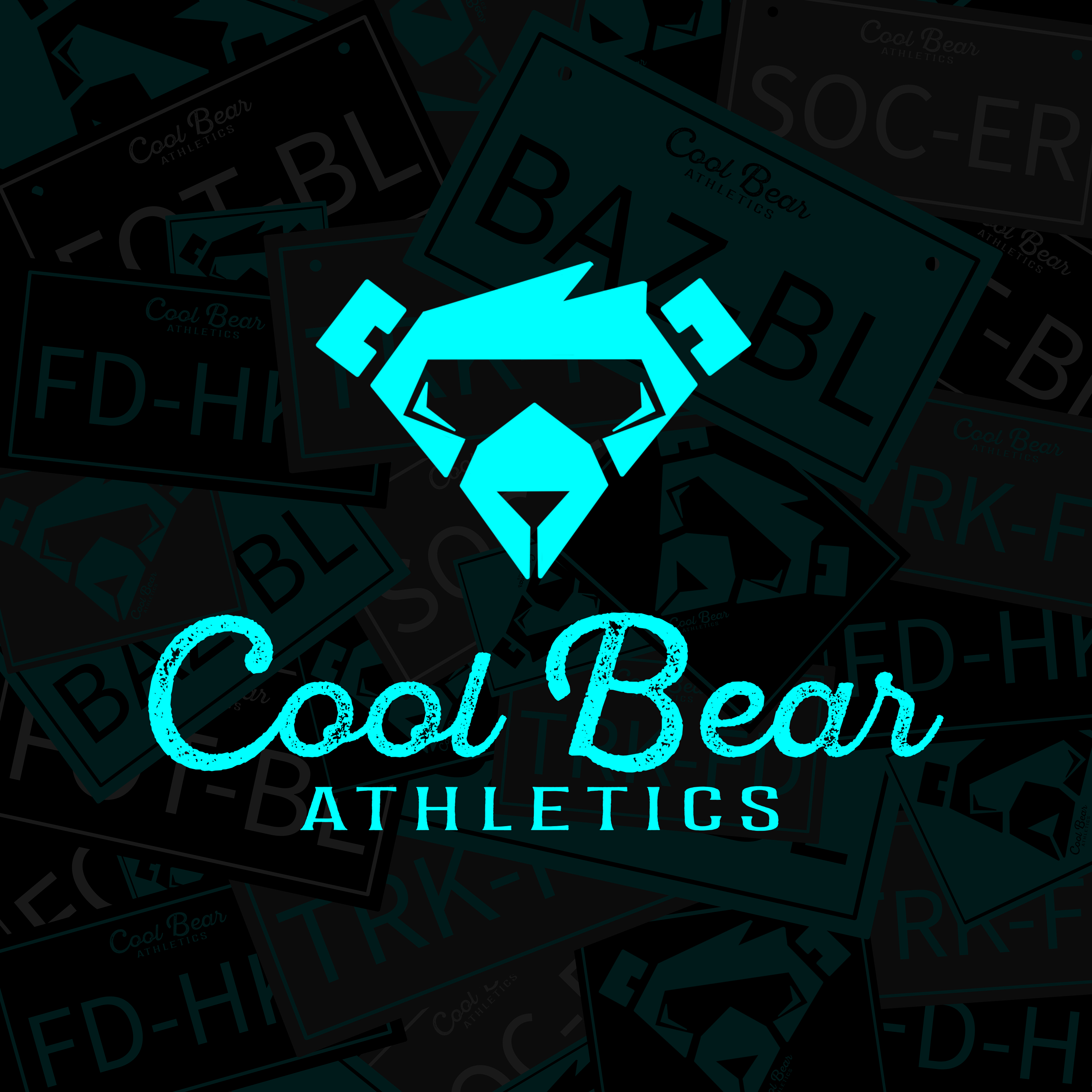
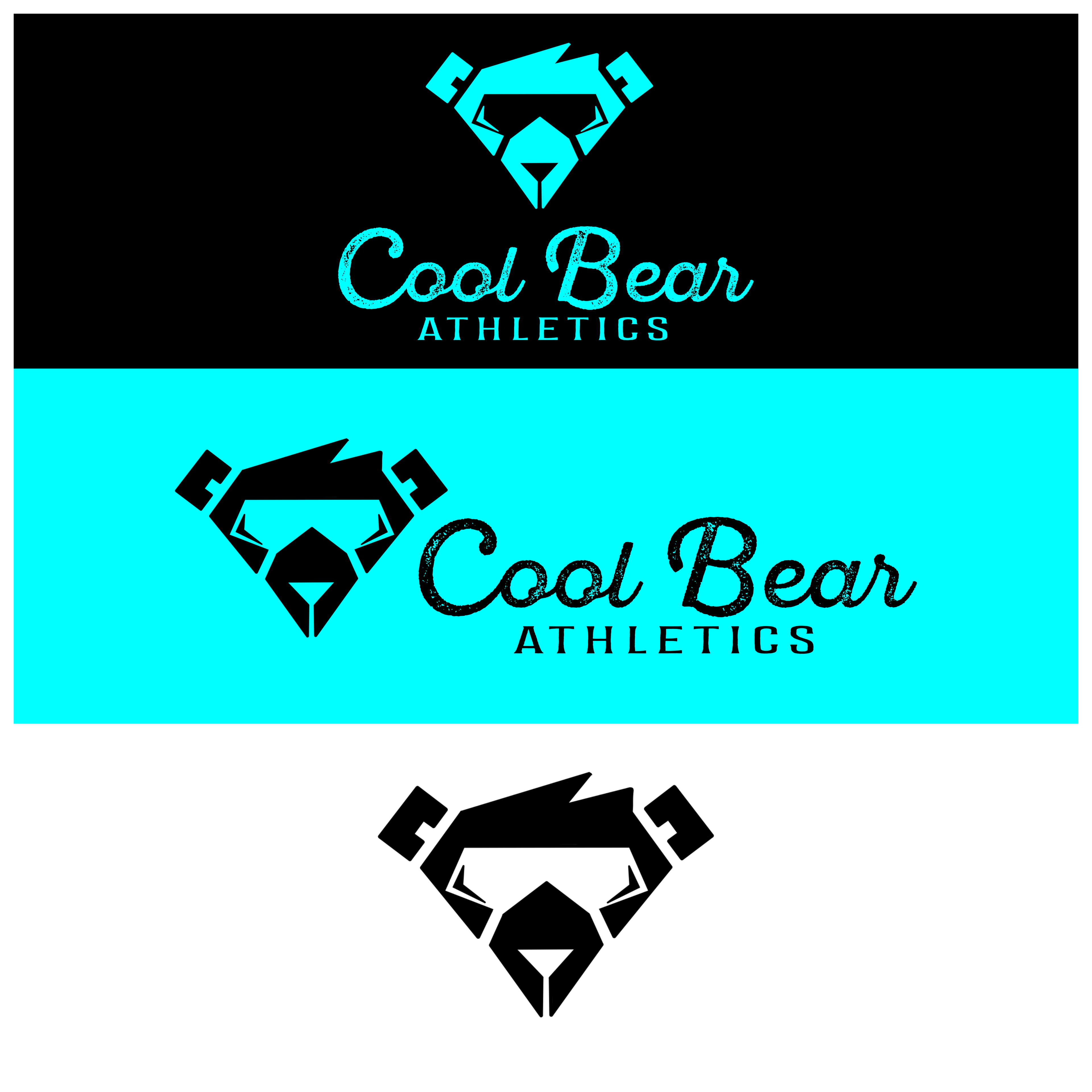
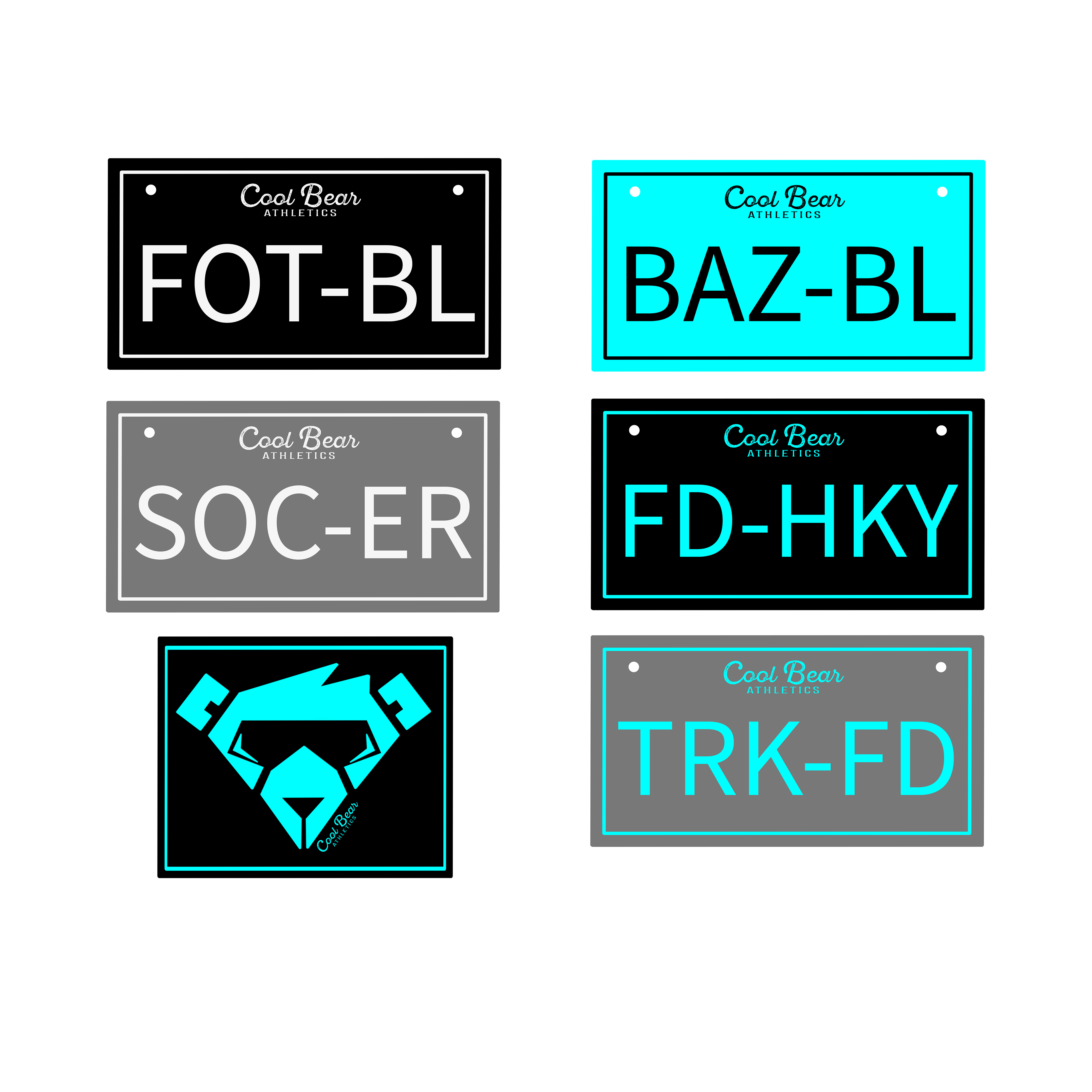
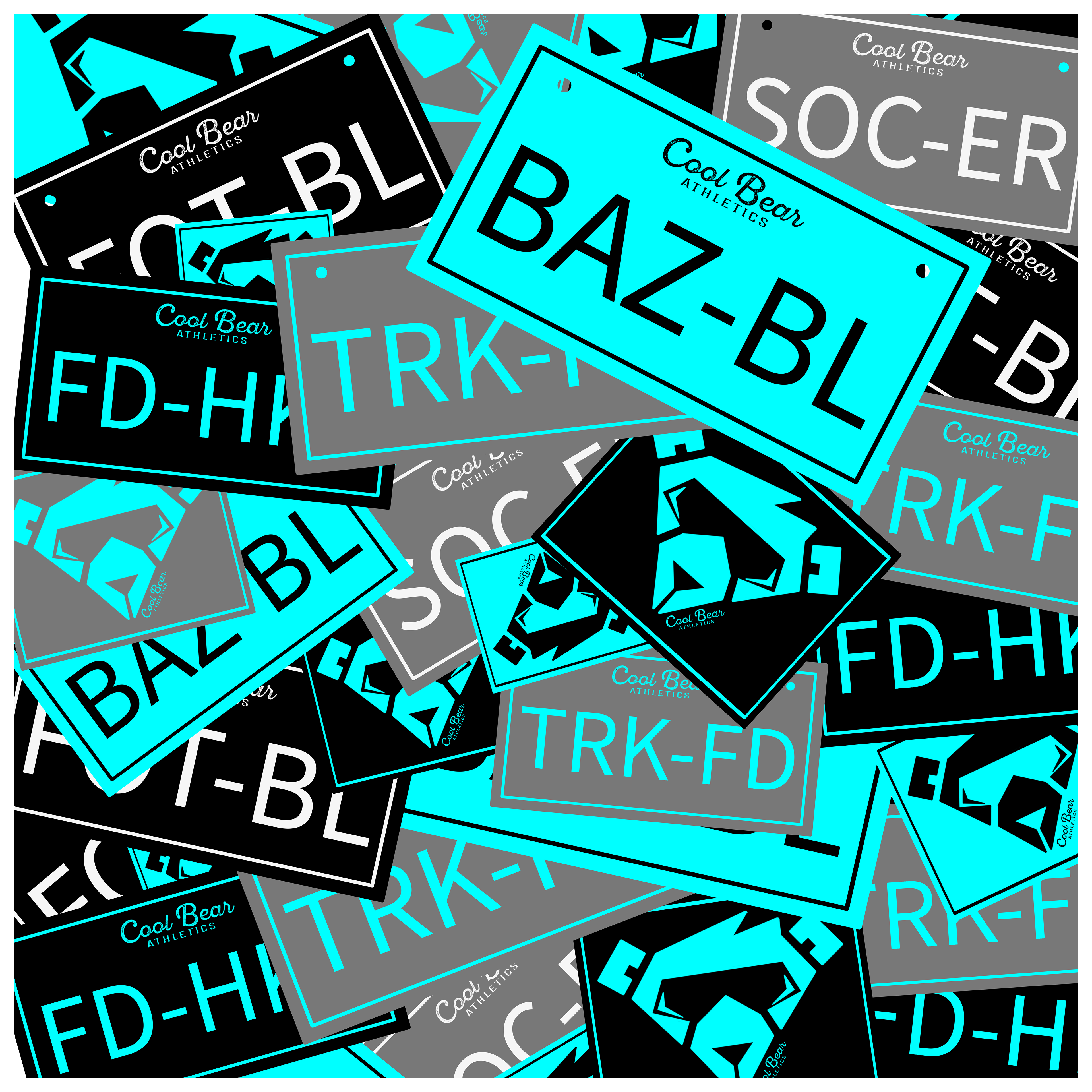
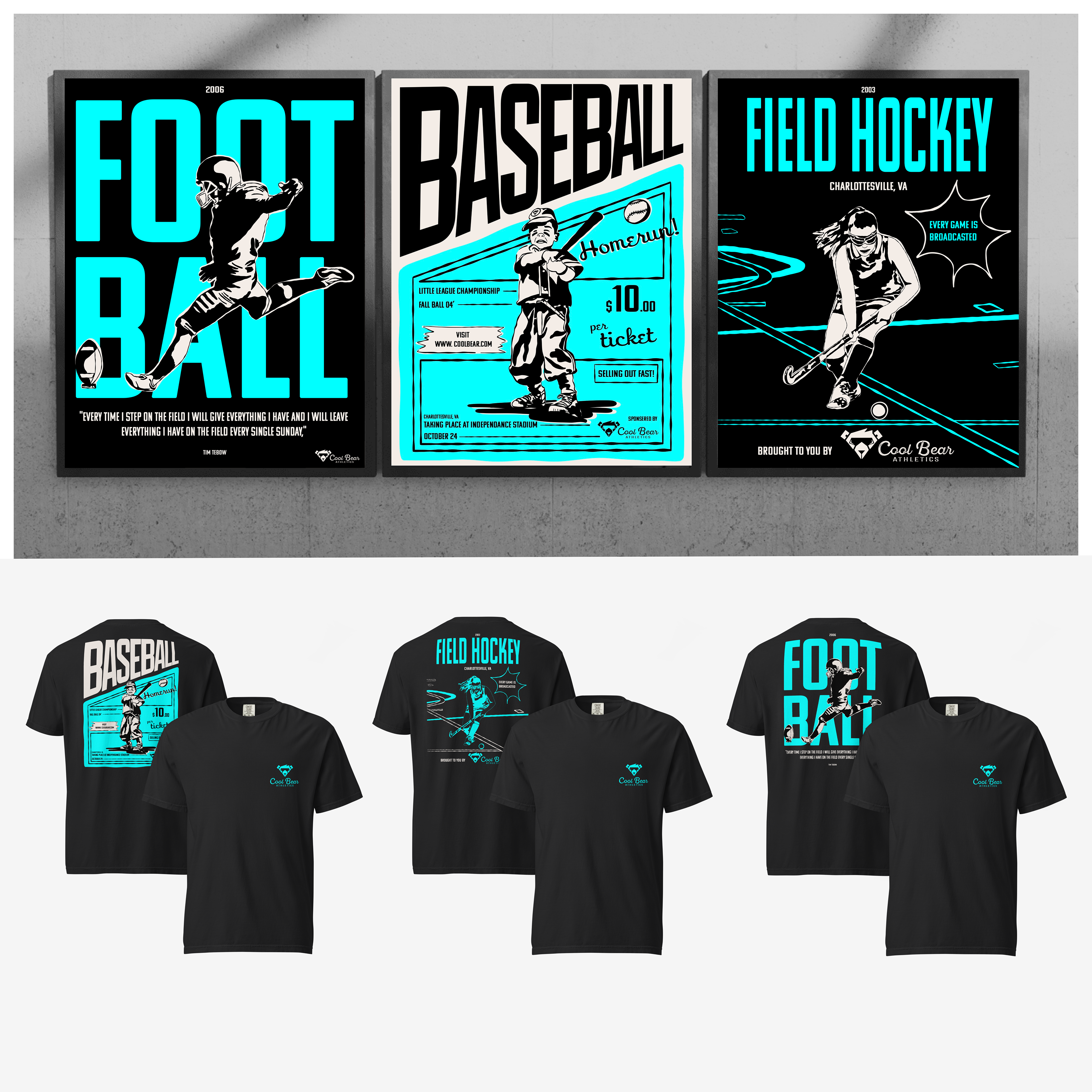
Cool Bear Athletics
Branding
The Cool Bear Athletics logo is eye-catching and captures the idea of strength, style, and modernity. The design features a bold, sleek bear head wearing a pair of cool sunglasses often worn by athletes. The bear conveys the idea of power and determination, while the sunglasses add a contemporary, confident edge, appealing to active and style-conscious individuals. The logo balances sharp details with clean lines, ensuring versatility across apparel, branding materials, and digital platforms.